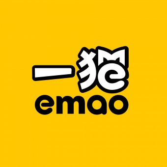
Emao.com Logo and VI by Dongdao Creative Branding Group |
Home > Winners > #52599 |
 |
|
||||
| DESIGN DETAILS | |||||
| DESIGN NAME: Emao.com PRIMARY FUNCTION: Logo and VI INSPIRATION: We concluded that graphical font can well facilitate visual recognition and communication in Chinese internet brands. We created the logo comprising Chinese characters ‘一猫汽车网� UNIQUE PROPERTIES / PROJECT DESCRIPTION: emao.com is a fire-new internet platform for auto trade, targeting at young consumers of the 1985s to 1990s. It aims to tackle the issue "What car to buy? At what price? Where to buy?" so as to provide convenience to customers. In addition to functional demands, the logo shall also convey a personalized brand image and interaction mode. OPERATION / FLOW / INTERACTION: In addition to functional demands, the logo shall also convey a personalized brand image and interaction mode. After repetitive auditing and analyzing, we concluded that graphical font can well facilitate the visual recognition and communication in Chinese internet brands. Generally, yellow symbolizes warmness, hope, fashion and openness while black symbolizes profession, thus we selected yellow and black in the color scheme. The overall effect of the logo presents a sense of stability, loveliness, profession and flexibility, manifesting professional and interesting features and unique recognition property of emao.com. PROJECT DURATION AND LOCATION: The project started in February 2015 in Beijing and finished in April 2015 in Beijing. FITS BEST INTO CATEGORY: Graphics, Illustration and Visual Communication Design |
PRODUCTION / REALIZATION TECHNOLOGY: We created the logo comprising Chinese characters ‘一猫汽车网� SPECIFICATIONS / TECHNICAL PROPERTIES: - TAGS: - RESEARCH ABSTRACT: We created the logo comprising Chinese characters ‘一猫汽车网� CHALLENGE: It confuses us how to well convey the internet property of auto industry while conserving the brand characteristics. Through repetitive auditing and analyzing, we concluded that graphical font can well facilitate the visual recognition and communication in Chinese internet brands. ADDED DATE: 2017-01-12 06:27:50 TEAM MEMBERS (1) : Dongdao Design Team IMAGE CREDITS: Dongdao Creative Branding Group, 2016. |
||||
| Visit the following page to learn more: http://www.dongdao.net/ | |||||
| AWARD DETAILS | |
 |
Emao.com Logo and Vi by Dongdao Creative Branding Group is Winner in Graphics, Illustration and Visual Communication Design Category, 2016 - 2017.· Press Members: Login or Register to request an exclusive interview with Dongdao Creative Branding Group. · Click here to register inorder to view the profile and other works by Dongdao Creative Branding Group. |
| SOCIAL |
| + Add to Likes / Favorites | Send to My Email | Comment | Testimonials | View Press-Release | Press Kit |


