Emporium St Isabel Multifunctional Commerce by David Guerra and Laura Rabe |
Home > Winners > #52577 |
 |
|
||||
| DESIGN DETAILS | |||||
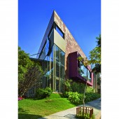
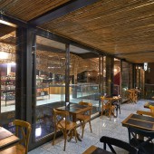
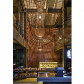
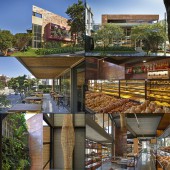
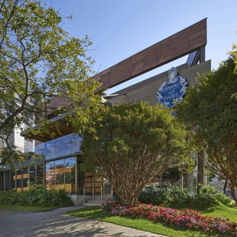
| DESIGN NAME: Emporium St Isabel PRIMARY FUNCTION: Multifunctional Commerce INSPIRATION: The idea for Santa Isabel Emporium was to build a technological, contemporary architecture in a more affective way, referring to the tradition of the countryside and baroque style of Minas Gerais. There was also a drive to mimic trough the materials the essence of the emporium by using the clay textured concrete panels that seem in the middle of the process of being cooked. UNIQUE PROPERTIES / PROJECT DESCRIPTION: Located in a corner of the main road of the area, with wide gardens, the metal structure, glass and clay building had a positive impact in the area. Today, the local people help to care for the garden. The concept of the architecture and interior design project of the Santa Isabel Emporium reached a wide range of complementary projects, from landscape to the graphic identity. The Emporium has an area of over a thousand square meters. OPERATION / FLOW / INTERACTION: In the basement are the stock, dressing room, and bread production area. In the ground level, we have the bakery, patisserie, emporium and auxiliary kitchen. The products are displayed in wood and metal light, fluid shelves. Refrigerated display cases illuminated in LED lights show the products in a clean and seductive way. Island display counters show featured products right at the entrance to catch the clients’ eye. At the back, a metal shelf holds a wide selection of wines. In the first floor, with a nice view of the gardens, there is a breakfast, lunch and happy hour buffet, a pizzeria and a special products market. A footbridge links this space with the outside balcony, with a bamboo ceiling, the same material as the sculptural lamp that goes through the whole side of the emporium, creating a cozy atmosphere and an impact illumination. In this floor we also have an auxiliary kitchen, the administration office and restrooms. In the second floor we have the patisserie production, stock, staff resting area and staff restrooms. PROJECT DURATION AND LOCATION: The project was executed in 2014 in Belo Horizonte, Minas Gerais, Brazil FITS BEST INTO CATEGORY: Architecture, Building and Structure Design |
PRODUCTION / REALIZATION TECHNOLOGY: The building is made in metal structure, painted with automotive paint, clay textured concrete panels finishing, with accessibility through ramps and a lift, big glass panels with aluminium golden coloured frames, a balcony with a bamboo ceiling, bordeaux, golden, copper and colonial blue as theme colours of the brand identity, LED lamps in rails, gardens with fruiting trees and walls covered with old metal fences and plant vases. SPECIFICATIONS / TECHNICAL PROPERTIES: With a total constructed area of 1.050m2 the emporium is a standing landmark on the area. The sustainability is present in a number of factors, such as the metal structure, pre-fabricated ceiling and dry-wall panels, making it a fast constructed building and reducing waste production. Other factors are the energy saving LED illumination, the great natural illumination, the cross ventilation, in using hand-made bamboo items bought from local craftsmen, wood and clay textured concrete. TAGS: Emporium, Bakery, Patiserrie Clay, Steel, David Guerra RESEARCH ABSTRACT: In terms of research there was a deep investment in the development of a new material for the outside, that being the concrete panels textured like clay giving a almost humid-like appearance. Also the use of automotive paint on the metallic structure was studied for its diversified color pallet and resistance. Besides the materials there was a deep study on the social impact on the area so that the emporium could have an almost symbiotic relationship with the neighborhood. CHALLENGE: The big challenge was to create a comfortable, functional and cozy atmosphere in a multifunctional commercial environment build on a metallic struture with ample usage of glass and an entirely new material developed solely for this project. The development of the material was without a doubt a challenging process to acieve the clay-like look on the concrete giving the impression of humidity to the surface and referencing at the same time the cooking of the bread. ADDED DATE: 2017-01-11 13:40:42 TEAM MEMBERS (1) : David Guerra - Laura Rabe IMAGE CREDITS: Jomar Bragança (Photographer) |
||||
| Visit the following page to learn more: http://davidguerra.com.br/en | |||||
| AWARD DETAILS | |
 |
Emporium St Isabel Multifunctional Commerce by David Guerra and Laura Rabe is Winner in Architecture, Building and Structure Design Category, 2016 - 2017.· Press Members: Login or Register to request an exclusive interview with David Guerra and Laura Rabe. · Click here to register inorder to view the profile and other works by David Guerra and Laura Rabe. |
| SOCIAL |
| + Add to Likes / Favorites | Send to My Email | Comment | Testimonials | View Press-Release | Press Kit |

