DESIGN NAME:
Mei Shih De
PRIMARY FUNCTION:
Space
INSPIRATION:
More than sales, the consumption behavior of an issue represents the life style and living attitude. Breaking the stereotype of health dietary industry is a goal pursuing the precious value of life and health body. The designer, in this work, has remodeled the sales pattern and general space idea that bring people to this store in which full of the atmosphere of relaxation and the story about the brand.
UNIQUE PROPERTIES / PROJECT DESCRIPTION:
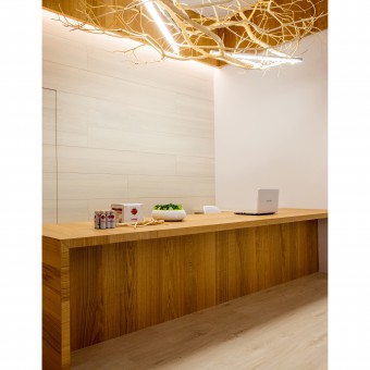
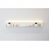
The most attracting visuals are seen from the perspectives of building structures and lighting strips. Meanwhile, the linear design skill, the wooden lighting and exhibit counter has excellently demonstrated the design of entrance. The skillful design inspires the customers' motivations knowing further to the products, the marking skill successfully advocating the topic of health. This design work has shown brilliantly the integration of profession and wisdom without triteness.
OPERATION / FLOW / INTERACTION:
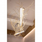
For the simple design ideas, the designer has make the finishing touch when planning the individual space. Furthermore, the designer has ingeniously decorated the clean and well-organized space with wooden lighting and loofah. The organic elements of style demonstrate power of life and concept of recycling, the design idea of great interest.
PROJECT DURATION AND LOCATION:
The project finished in November 2016 in Taipei City, Taiwan.
FITS BEST INTO CATEGORY:
Interior Space and Exhibition Design
|
PRODUCTION / REALIZATION TECHNOLOGY:
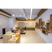
The unsophisticated rectangular pattern, brought into existence in the indoor space, displays the atmosphere of accordance. The myriads of change, in the form of square space, had become a part of wooden ceiling frames, information center, washbasin, products showcases and large wooden cabinets, which has present both the idea of multiple styles and practicality.
SPECIFICATIONS / TECHNICAL PROPERTIES:
90 square meters
TAGS:
Space
RESEARCH ABSTRACT:
The spirit of concerned, in this store, nothing more than simplicity and pureness, which consistently correspond to the idea of health, the brand image and the design of interior space. The contrast between the white and burly wood make the issue of "healthy life" become the major idea in the space. The entire indoor space presents before people the graceful characteristic, brightness and comfort, by means of white space walls and ceiling, wooden floor and harmonious wood works. The selection of construction materials comes from the idea of nature, and the interior design brings out the characteristics of logical configuration, excellence of design skills and invigorating space.
CHALLENGE:
The marketing strategy, in accordance with brand story, had brought into existence the space specifically for customers. The square showcase, planted on the wall, shows the fundamental products, the design idea making the geometric pattern vigorous. Meanwhile, the area for fresh loofah and fitness equipment is spilled with clients contact relationship, making the space full of relentless imaginations.
ADDED DATE:
2017-01-11 06:40:20
TEAM MEMBERS (1) :
Chih-Ching Chen
IMAGE CREDITS:
Photo by Chi-Kwang Lu
|
