XJ Bank Logo and VI by Dongdao Creative Branding Group |
Home > Winners > #52515 |
 |
|
||||
| DESIGN DETAILS | |||||
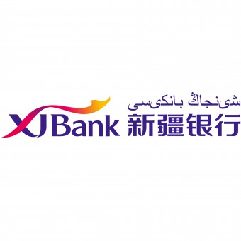
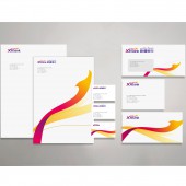
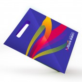
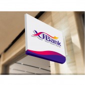
| DESIGN NAME: XJ Bank PRIMARY FUNCTION: Logo and VI INSPIRATION: Considering the regional features and historical background of Xinjiang, we extracted initials 'X' and 'J', and connected them with a silk ribbon to convey the concept of connectivity, highlighting the role of Xinjiang in both regional and international development. The silk ribbon color is mainly inspired by the geographical landscape environment, manifesting the local features. Connection of 'X' and 'J' makes 'U', representing the partner and the client, showing the service concept of XJ Bank. UNIQUE PROPERTIES / PROJECT DESCRIPTION: Headquartered in Urumchi, Bank of Xinjiang is a new-type regional bank established in minority location. As a municipal commercial bank, it and other existing banking institutions supplement each other so as to better fulfill all-level financial demands for the economic and social development of such autonomous region. OPERATION / FLOW / INTERACTION: Bank of Xinjiang is a new-type regional bank established in minority location. Considering this particularity, the logo shall facilitate the distinguishing of Bank of Xinjiang from other regional banks, also comprising modern bank features. Both regional characteristics and future international trend shall be taken into account. PROJECT DURATION AND LOCATION: The project started in May 2016 in Beijing and finished in August 2016 in Beijing. FITS BEST INTO CATEGORY: Graphics, Illustration and Visual Communication Design |
PRODUCTION / REALIZATION TECHNOLOGY: Bank of Xinjiang is a new-type regional bank established in minority location. Considering this particularity, the logo shall facilitate the distinguishing of Bank of Xinjiang from other regional banks, also comprising modern bank features. Both regional characteristics and future international trend shall be taken into account. SPECIFICATIONS / TECHNICAL PROPERTIES: - TAGS: VI, Bank, Regional, Feature RESEARCH ABSTRACT: Considering all the above features, we extracted the initials of Xinjiang ‘X’ and ‘J’, and connected them with a silk ribbon to convey the concept of connectivity, highlighting the role of Xinjiang in both regional and international development. The color of the silk ribbon is mainly inspired by the geographical landscape environment, manifesting the local features. Connection of ‘X’ and ‘J’ conveys a concept of ‘U’ which represents the partner and the client, showing the service concept of Xinjiang Bank. The font color impresses people with a formal sense of solemnity, coinciding with the bank attributes. CHALLENGE: It's a challenge for us in the logo design how to convey the regional features of Xinjiang and the financial properties of XJ Bank. Through constant research and analysis, we extracted the initials of Xinjiang ‘X’ and ‘J’, and connected them with a silk ribbon to convey the concept of connectivity, highlighting the role of Xinjiang in both regional and international development. The color of the silk ribbon is mainly inspired by the geographical landscape environment, manifesting the local features. Connection of ‘X’ and ‘J’ conveys a concept of ‘U’ which represents the partner and the client, showing the service concept of Xinjiang Bank. The font color impresses people with a formal sense of solemnity, coinciding with the bank attributes. ADDED DATE: 2017-01-09 06:26:03 TEAM MEMBERS (1) : Dongdao Design Team IMAGE CREDITS: Dongdao Creative Branding Group, 2016. |
||||
| Visit the following page to learn more: http://www.dongdao.net/ | |||||
| AWARD DETAILS | |
 |
Xj Bank Logo and Vi by Dongdao Creative Branding Group is Winner in Graphics, Illustration and Visual Communication Design Category, 2016 - 2017.· Press Members: Login or Register to request an exclusive interview with Dongdao Creative Branding Group. · Click here to register inorder to view the profile and other works by Dongdao Creative Branding Group. |
| SOCIAL |
| + Add to Likes / Favorites | Send to My Email | Comment | Testimonials | View Press-Release | Press Kit |


