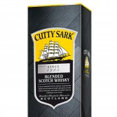
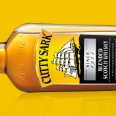
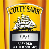
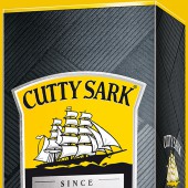
Cutty Sark Packaging Packaging by Taali Creative |
Home > Winners > #52437 |
 |
|
||||
| DESIGN DETAILS | |||||
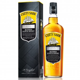
| DESIGN NAME: Cutty Sark Packaging PRIMARY FUNCTION: Packaging INSPIRATION: The criss-crossed lines symbolize the rough and stormy seas that the Cutty clipper and her crew braved to bring their cargo to shore. The subtle black color of the carton caters to the category codes of a premium scotch segment and provides the premium exclusivity that the Indian consumer is looking for. The trademark yellow of the brand contrasts well and research shows the shelf presence is good. UNIQUE PROPERTIES / PROJECT DESCRIPTION: The brief was to create a brand new design that combined the key features of the Cutty Sark brand globally and applied it successfully to the creation of a package design for the Indian Market. OPERATION / FLOW / INTERACTION: The criss-crossed textured pattern combined with a strategic choice of using a subtle black color made the brand distinctly stand apart from the ornate and assembly-line looking design by competing brands. Cutty Sark Whisky's brand ideology is daring to different and never settling on laurels. Our packaging design conveys the same through visual elements to our customers who also espouse these values. PROJECT DURATION AND LOCATION: All design projects including the above were undertaken at our design studio in Gurgaon, Haryana, India FITS BEST INTO CATEGORY: Packaging Design |
PRODUCTION / REALIZATION TECHNOLOGY: Adobe Illustrator, Adobe Photoshop, Corel Draw Graphics Suite. SPECIFICATIONS / TECHNICAL PROPERTIES: 90mm X 68mm X 314mm 400 GSM folding box board with UV texture and silver foiling. Pattern has gradient which is enhanced by detailed texture varnish. Spot UV on the ship element and the shield element. TAGS: Monocarton packaging, Textured Pattern, hot foil detailing, Spot UV technique, texture varnish, premium and exclusive design, designed for the Indian market RESEARCH ABSTRACT: The outlook on Scotch whisky in India is quintessentially grandiose and masculine. It’s a prestigious drink that symbolizes achievement and great success. True to its brief, the packaging was designed as such keeping in mind that these sentiments came to fore. The brand colors were used to create a premium and exclusive feeling. Using the spot UV technique and hot silver foil detailing - the textural pattern was enhanced giving a distinct look characteristic of the brand. CHALLENGE: The challenge was to create a brand new design that fit perfectly with the global brand identity at the same time was relevant in the Indian market context. We needed to create an innovation in the existing range of products available in the scotch whisky segment and appeal to the Indian consumer who was searching for a differentiated, superior and exclusive experience. ADDED DATE: 2017-01-03 13:39:38 TEAM MEMBERS (1) : 3 IMAGE CREDITS: Taali Creative |
||||
| Visit the following page to learn more: https://www.taalicreative.com/our-servic |
|||||
| AWARD DETAILS | |
 |
Cutty Sark Packaging Packaging by Taali Creative is Winner in Packaging Design Category, 2016 - 2017.· Press Members: Login or Register to request an exclusive interview with Taali Creative. · Click here to register inorder to view the profile and other works by Taali Creative. |
| SOCIAL |
| + Add to Likes / Favorites | Send to My Email | Comment | Testimonials | View Press-Release | Press Kit |

