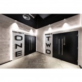
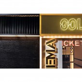
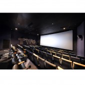
Golden Harvest Fanling Cinema by ARTTA Concept Studio |
Home > |
| CLIENT/STUDIO/BRAND DETAILS | |
 |
NAME: ARTTA Concept Studio PROFILE: ARTTA Concept Studio is an International Multi-Award Winning innovative interior.architecture design firm based in Hong Kong, established in 2010 by Arthur Tang. He graduated at The University of New South Wales with a Bachelor Degree in Interior Architecture. The philosophy behind ARTTA comes from the word ART that defines our soul and with Architecture being our intelligence, combining these together bringing ART To Architecture. Our team are built from talented individuals who have been trained globally and have unified together to work seamlessly to create projects with craftsmanship, timelessness and endless possibilities; designs that have their own characteristics. |
| AWARD DETAILS | |
 |
Golden Harvest Fanling Cinema by Artta Concept Studio is Runner-up for A' Design Award in Interior Space and Exhibition Design Category, 2017 - 2018.· Press Members: Login or Register to request an exclusive interview with ARTTA Concept Studio. · Click here to register inorder to view the profile and other works by ARTTA Concept Studio. |
| SOCIAL |
| + Add to Likes / Favorites | Send to My Email | Comment | Testimonials |

