DESIGN NAME:
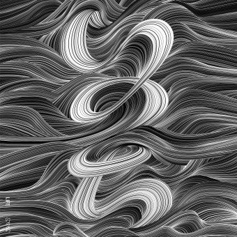
LIFE
PRIMARY FUNCTION:
Poster
INSPIRATION:
It is said that the birth of the life is from the sea.
This imaged the picture of the wave to come up in an old Japanese painting well. This is the minute design which is possible simply because it is a modern computer technology.
The typography we used,is ink painting from Japanese culture.
UNIQUE PROPERTIES / PROJECT DESCRIPTION:
This client is a company with the history of 100 years in Hiroshima
In the Hiroshima atomic bombing of 1945, the factory burned down, and about 50 members died.
In late years, many lives are lost suddenly by natural disasters as well as war,
I wanted to convey the preciousness of the life.
This typography is Japanese. It is written as life in Japanese.
OPERATION / FLOW / INTERACTION:
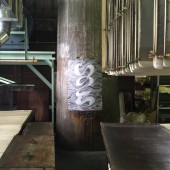
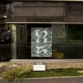
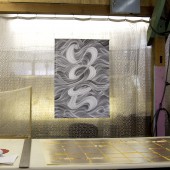
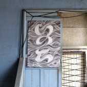
This poster is put on the factory with Hiroshima. In the factory, I make wall paper of the gold leaf for 100 years. In 1945, an atom bomb fell into Hiroshima. The many staff died in this factory. This factory is authorized by the being bombed building and still leaves the symbolic chimney of the factory. The technique to set up following gold leaf by hand is still succeeded from old days. I am written as "Life" in Japanese on this poster. War happens all over the world, and many people still die. I made this poster as a message to the people who lived in mourning and now to predecessors in the family line.
PROJECT DURATION AND LOCATION:
The project started in August 2015 in Hiroshima in Japan.A poster is still displayed all the time in a factory.
FITS BEST INTO CATEGORY:
Graphics, Illustration and Visual Communication Design
|
PRODUCTION / REALIZATION TECHNOLOGY:
I produced this design using an illustrator. I designed the whole by adjusting thickness of each pass.
I always produce it while being conscious of the design which I have not seen so far. Black print appears clearly and is the offset printing that paste of the print has good
SPECIFICATIONS / TECHNICAL PROPERTIES:
width 728mm,Height 1030mm
TAGS:
Poster,Life,Peace,Wave,Typography,Sea,Ja
panese,
RESEARCH ABSTRACT:
I wanted to just tell a message to the person who worked in this factory with this poster. And I thought that I wanted the joy that inherited a Japanese tradition technology to continue more than 100 years, joy cheerful, to work, the importance of the life to soak into the body. As for this, the poster which I wrote as "LIFE" to people who visited this factory seemed to have an impact. With one piece of only poster, I think it to have been able to report what it is to the heart of people.
CHALLENGE:
I believe that the world changes with one piece of only poster. I write this poster as "a life" in Japanese. The person stops by all means and, in front of this poster, sees it. It is said that the birth of the life is from the sea. It is the typography that was totally written like a wave in a small line. I lose death by the natural disaster, death by the war, the life of the person suddenly. Only the war is a peace poster with all a meaning to want you to disappear from the world at least. I believe that the meaning of the poster reached the person who stops, and sees it.
ADDED DATE:
2016-12-05 16:07:02
TEAM MEMBERS (3) :
Art Director:Hajime Tsushima, Designer:Hajime Tsushima and Copy writer:Yukiko Tsushima
IMAGE CREDITS:
Optional Image #1,#2,#3,#4 Photographer Yukiko Tsushima
|
