700bike Logo and VI by Dongdao Design Team |
Home > Winners > #51981 |
 |
|
||||
| DESIGN DETAILS | |||||
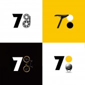
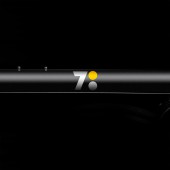
| DESIGN NAME: 700bike PRIMARY FUNCTION: Logo and VI INSPIRATION: In Chinese pronunciation “7 o’clock” is phonetically similar to “origin” or “starting point”, we subtly created the figure “700” into a time concept “7:00 (7 o’clock)”. Originating from this time concept, the logo we designed implies that 700bike is the origin or start of new bicycle culture and fashionable lifestyle in China. UNIQUE PROPERTIES / PROJECT DESCRIPTION: 700bike is an information platform for brands and trends of new generation bicycles. Originating from the time concept, our logotype implies that 700bike is the origin or start of a new bicycle culture and a fashionable lifestyle in China. Its aim is to bring a new solution to users riding throughout the city more easily, happily and intelligently, realizing a smoother urban transportation mode. OPERATION / FLOW / INTERACTION: Originating from the time concept, our logotype implies that 700bike is the origin or start of a new bicycle culture and a fashionable lifestyle in China. Its aim is to bring a new solution to users riding throughout the city more easily, happily and intelligently, realizing a smoother urban transportation mode. PROJECT DURATION AND LOCATION: The project started in April 2015 in Beijing and finished in August 2015 in Beijing FITS BEST INTO CATEGORY: Graphics, Illustration and Visual Communication Design |
PRODUCTION / REALIZATION TECHNOLOGY: In Chinese pronunciation “7 o’clock” is phonetically similar to “origin” or “starting point”, we subtly created the figure “700” into a time concept “7:00 (7 o’clock)”. Originating from this time concept, the logo we designed implies that 700bike is the origin or start of new bicycle culture and fashionable lifestyle in China. Besides, considering a colon generally implies a statement, representing the start of a speech or a story, we ingeniously combined colon with "7:00", thus conveying a bicycle culture and fashion trend as well as the life attitude of 700bike. SPECIFICATIONS / TECHNICAL PROPERTIES: We adopted a unique font for the brand to convey a lively feeling. TAGS: Logo, VI, sport, young RESEARCH ABSTRACT: The IT industry in China is different from the world. Nowadays, every product, service are connected online, truely fulfilled into an internet of things. With this dramatic transformation of consumption, the traditional way of VI and logo needs to change to conform with IT industry. This brand, 700bike, featuring young and motion, thus we adopted the round structure, and the concept of time to enhance the brand image. CHALLENGE: We had face the difficulty that we have to persuade and educate the clients about the dramatic change of the logo under IT age and the traditional way. ADDED DATE: 2016-12-05 02:41:17 TEAM MEMBERS (1) : Dongdao Design Team IMAGE CREDITS: Dongdao Design Team, 2016. |
||||
| Visit the following page to learn more: http://www.700store.com/index | |||||
| AWARD DETAILS | |
 |
700bike Logo and Vi by Dongdao Design Team is Winner in Graphics, Illustration and Visual Communication Design Category, 2016 - 2017.· Press Members: Login or Register to request an exclusive interview with Dongdao Design Team. · Click here to register inorder to view the profile and other works by Dongdao Design Team. |
| SOCIAL |
| + Add to Likes / Favorites | Send to My Email | Comment | Testimonials | View Press-Release | Press Kit |


