Skiclub Kampen North Sea Spirits Bottle by Ulrich Graf |
Home > Winners > #50935 |
 |
|
||||
| DESIGN DETAILS | |||||
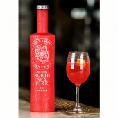
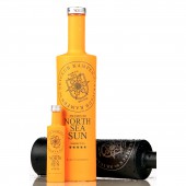
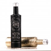
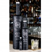
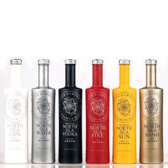
| DESIGN NAME: Skiclub Kampen North Sea Spirits PRIMARY FUNCTION: Bottle INSPIRATION: The project is based on the brand foundation of Sylt in the North Sea, the pureness, freshness of the sea and smoothness of the wadden sea. Kampen is the best known place of Sylt and is located at the most narrow part of the island, surrounded by the rough North Sea, and the smooth Wadden Sea, an UNESCO world heritage. With all these impressions in mind it was mandatory to design a very particular bottle, with which one can feel the extraordinary pureness, clearness and beauty of Sylt. UNIQUE PROPERTIES / PROJECT DESCRIPTION: The uniqueness of the bottle impresses via pureness, simpleness and clearness. In contrast to most other bottles, North Sea Spirts are fully covered by an organic surface coating and labelling. Each of the 6 flavors are defined by one specific color. The bottle is unicolored with an organic label print. The content of the 4 mixed drinks is identical to the color of the bottle. The coating of the surface delivers a especially pleasant handfeel. The netweight of 862gr adds to the value perception. OPERATION / FLOW / INTERACTION: The end-user interacts with the bottle to serve a fresh and delightful drink of Vodka, Gin or flavored Vodka-based mixed drink. The haptic of the bottle is very different to other spirit bottles and already gives a feeling of what to expect from the drink by touching the bottle and pouring the delightful spirit into a glass filled with ice cubes. PROJECT DURATION AND LOCATION: The project started in May 2012 when Strandistel GmbH was founded, located in Kampen / Sylt. The idea was born in July 2012 and in October we started with the first bottle (Vodka, black bottle). In 2013 followed Gin (white bottle), Fire (red bottle / selection of blood orange juices with vodka) and Water (silver bottle / lemon and grapefruit juices with vodka). In 2014 we launched Sand (golden bottle / Advocaat), followed by Sun (orange bottle / Vodka mixed with passionfruits) in 2015. FITS BEST INTO CATEGORY: Packaging Design |
PRODUCTION / REALIZATION TECHNOLOGY: The underlying idea and requirement of the design was to differentiate from all other spirit bottles. Therefore Ulrich Graf came up with the idea to fully cover the bottle by an uni-colored surface, which is visible from a distance of 10-15meters. By this time there were not many fully covered bottles on the market. This trend has by now been taken over by champagne bottles (Iced champagne), however within the long drink sector, the bottles of North Sea Spirits remain unique. The technical realization was made together with industrial partners, who deliver the white glass bottle and organic surface coverage. SPECIFICATIONS / TECHNICAL PROPERTIES: Capacity 70cl, Finish: GPI 400/33, Weight 862gr, overall height: 312,2mm, Base section: 75,9mm, minimum through bore: 19mm, maximum filling tube diameter: 18mm, fill height: 52mm, glass colour: extra white flint, quality: high grade, base thickness: 16mm minimum TAGS: North Sea Spirits, Skiclub Kampen, Sylt, Gin, Vodka, Advocaat, Vodka mixed drinks, pure bottle design, premium spirits, Stranddistel RESEARCH ABSTRACT: After extensive market observation we saw the only chance to place a new product in the spirit market in being very different versus all global players and established brands. We had to distinguish our product from all others by applying a unique, pure and impactful visual appearance which represents the pureness of the content. The requirement of Ulrich Graf was to create a design which can be recognize across a distance of 15-20 meters in a restaurant, bar or club. The design has been developed without external market research. It should be a stand-alone design. CHALLENGE: The 1st challenge was to find a possibility of a high quality presentation with a unique surface feel of the bottle, different to commonly used colored glass with a paper label. After 3 months research the possibility of an organic surface coating has been found. This technique delivers the feeling of having something very valuable in your hand, with a soft and warm handfeel, condensed water rolls off like from a lotus flower and the colors appear brilliantly. The 2nd challenge was to create the right shade of color for each specific flavor. Lots of trials were necessary to find the right specifications. ADDED DATE: 2016-09-29 18:51:19 TEAM MEMBERS (4) : Design Director Ulrich Graf, Co-Designer Anja Baumann, Co-Designer André Herrmann and Illustrator Cornelia Robrahn IMAGE CREDITS: Ulrich Graf, 2016. PATENTS/COPYRIGHTS: European Union, Geschmacksmuster (industrial design) Nr. 002176107 - 0001; registration January 31st, 2013 |
||||
| Visit the following page to learn more: http://www.skiclub-kampen.de | |||||
| AWARD DETAILS | |
 |
Skiclub Kampen North Sea Spirits Bottle by Ulrich Graf is Winner in Packaging Design Category, 2016 - 2017.· Press Members: Login or Register to request an exclusive interview with Ulrich Graf. · Click here to register inorder to view the profile and other works by Ulrich Graf. |
| SOCIAL |
| + Add to Likes / Favorites | Send to My Email | Comment | Testimonials | View Press-Release | Press Kit | Translations |

