Sydney Ugg Ecommerce Website by Cord and Berg |
Home > Winners > #50769 |
 |
|
||||
| DESIGN DETAILS | |||||
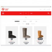
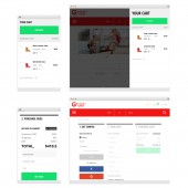
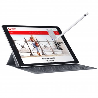
| DESIGN NAME: Sydney Ugg PRIMARY FUNCTION: Ecommerce Website INSPIRATION: The aim of the website was to create a modern platform where purchasing ugg boots could be an enjoyable and easy process while at the same time position the brand as an experienced, industry leader. We achieved this by utilising modern fonts, icons, colours and premium product photography in combination with references to the Sydney lifestyle, animated features and interactive functions to give the site an overall sleek look and feel - representative of a switched on, authentic Sydney company. UNIQUE PROPERTIES / PROJECT DESCRIPTION: The Sydney Ugg Co. website is designed to appeal to a premium local market, and the international tourist looking for authentic Australian Ugg Boots. To stand out in an already oversaturated market, full of fake product we focused on creating a modern design, while also streamlining the shopping experience through a custom one page checkout and features such as, allowing a user to switch between categories from within the product page, filter their search, create a profile and easily understand the height difference between products - the distinguishing and often difficult feature to determine when purchasing new boots. OPERATION / FLOW / INTERACTION: The distinguishing feature of the Sydney Ugg website is the one page checkout, that utilises overlays to prevent the process from being overwhelming - the checkout is validated at each step for efficiency. A user can also create a profile to track their order, rate the products they have purchased and save their billing details - to again speed up the checkout process. They can also compare prices or checkout in their local currency by using the Google API we have utilised for the currency drop down PROJECT DURATION AND LOCATION: December 2015 in Sydney - April 2016 in Sydney |
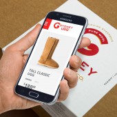
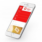
PRODUCTION / REALIZATION TECHNOLOGY: The website was built using the platform Laravel SPECIFICATIONS / TECHNICAL PROPERTIES: The website is a responsive design, automatically resizing across all browsers and devices. Taking the client's audience and the advanced javascript we have used into account we focused on the browsers; Chrome, Safari, Firefox, Opera, Microsoft 11 & Edge, iOs and android TAGS: ugg boots, ecommerce, digital, website, design, footwear, sydney, uggs RESEARCH ABSTRACT: Before beginning the design process we held a brand session with the client to pull out the necessary information we needed from them in terms of audience perception, TOV, audience segments, business goals and points of difference. We spent time looking at the latest functionality, competitor websites and the client's target agencies to develop something that would appeal to them. CHALLENGE: There is a trademarking law around using the word 'ugg' internationally. To overcome this challenge and still position Sydney Ugg as an authentic ugg boot company we designed a partner logo called 'Sydney Boot Co.' and explained that when international shipping methods are selected the product will be branded using the partner logo. This is explained in a clear and concise manner on both the 'about' page and during the checkout - only when international shipping is selected. ADDED DATE: 2016-09-28 06:47:49 TEAM MEMBERS (2) : Jeff Ginsburg and Samantha Cordingley IMAGE CREDITS: Cord and Berg, 2016. |
||||
| Visit the following page to learn more: https://ugg.sydney/ | |||||
| AWARD DETAILS | |
 |
Sydney Ugg Ecommerce Website by Cord and Berg is Winner in Website and Web Design Category, 2016 - 2017.· Press Members: Login or Register to request an exclusive interview with Cord and Berg. · Click here to register inorder to view the profile and other works by Cord and Berg. |
| SOCIAL |
| + Add to Likes / Favorites | Send to My Email | Comment | Testimonials | View Press-Release | Press Kit |

