DESIGN NAME:
GO WORK
PRIMARY FUNCTION:
Corporate Identity
INSPIRATION:
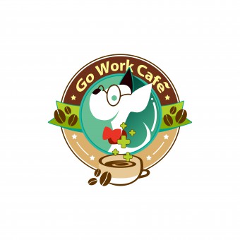
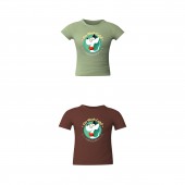
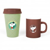
As an IT startup-themed cafe, having own culture is necessary. Go Work means go to work, and its Chinese homonym means doghouse. The puppy in the logo wants to convey loyal, optimistic, cheerful, laid-back characteristics.
UNIQUE PROPERTIES / PROJECT DESCRIPTION:
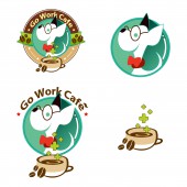
This is an IT startup-themed coffee, The design needs to highlight customer's professional characteristics, which is software engineering for young, enthusiastic and creative people. So the logo design is the cartoon character of a puppy wearing glasses. The whole logo composes different elements and these can be grouped into different styles according to requirements, thus the style is flexible and unified. This puppy gives people positive and optimistic impression, always enthusiastic and never give up.
OPERATION / FLOW / INTERACTION:
The logo recognition and meaning expression are directly related to the user's sense of belonging about the corporate, so the designer will continue to adjust the user's psychological acceptance, and make each user has community effect when seeing the logo image, and willing to introduce their friends to join it, so the logo needs to give people open, active and friendly tendency. The member can show their badge to indicate that they are a group of guys in the gathering. More and more friends will gather together through the image for sharing their experience and connections.
PROJECT DURATION AND LOCATION:
The project started in August 2016 in Shanghai.
FITS BEST INTO CATEGORY:
Graphics, Illustration and Visual Communication Design
|
PRODUCTION / REALIZATION TECHNOLOGY:
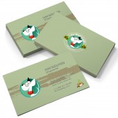
The image design of the logo is mainly used in card printing, goods packaging, advertising, membership badge, gift stickers.
SPECIFICATIONS / TECHNICAL PROPERTIES:
Take the 100X100mm as the basic size of logo, enlarging or reducing 25% of the original size as 1 unit, such as 25%, 50%, 100%, 200%, So different sizes can be used in the design of derivative products.
The color system: PANTONE Coated Color Reference.
The colors: 90C,732C,377C,382C,032C,1815C,100C,729C,
346C,339C,black and white.
The font: Pro Myriad.
TAGS:
Logo, graphic, visual recognition, coffee shop, animation
RESEARCH ABSTRACT:
The coffee shop located in the IT industry garden open work space, whose aiming expense crowd is entrepreneurs who are engaged in the IT Internet industry. We investigated the staff information of the company, including sex, hobby, age, school record in order to design can reflect of their own image tags, thus identifying their image. Choosing a puppy because people loving it, also the Chinese transliteration of the name "GO WORK" which is "doghouse", it implied meaning "chaotic office". It is very fit with working state of the entrepreneurs. So this is an extremely good creativity.
CHALLENGE:
The biggest challenge of this case is to persuade customers to accept the image of the puppy as a coffee shop, instead of using traditional coffee beans or coffee cups because there is no shop setting a precedent to use animals as the image on the market. In China, customers tend to apply conservative strategies in design to choose successful cases which already have in the market and follow these cases to imitate a similar design pattern. But designer's job is to discover, create new ideas and to lead customers to keep pace with the times.
ADDED DATE:
2016-09-26 13:07:19
TEAM MEMBERS (1) :
IMAGE CREDITS:
王沛, 2016.
|
