City Point Private Residence by Chiu Chi Ming Danny |
Home > Winners > #50685 |
 |
|
||||
| DESIGN DETAILS | |||||
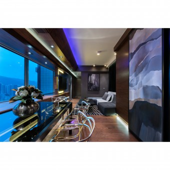
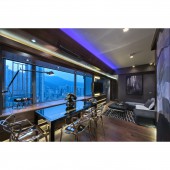
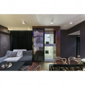
| DESIGN NAME: City Point PRIMARY FUNCTION: Private Residence INSPIRATION: Hong Kong is a cramped city full of high-rise buildings. However, different kinds of high-rise buildings in this city radiate their own charisma. Inspired by the surrounded buildings and the urban landscape outside the property, the theme of the design was set as Metropolitan, aiming to extend the scenery of a modern metropolitan from outside into the apartment. Therefore, abstract buildings were everywhere in the apartment. UNIQUE PROPERTIES / PROJECT DESCRIPTION: Creating space is the major concern for a home of 7 people. Flexibly applying visual effects in this project made the apartment more spacious with character. In order to create a dusky mood as required, dark palette was chosen so different lighting effects were added to create layers. The original layout of the living room was long and narrow with a large bay window. As such, materials with different shapes and texture were used to hide the bay window by transforming it into a sideboard and converting it into part of the living room, maximizing the use of space. OPERATION / FLOW / INTERACTION: An apartment less than 800 square feet is a bit cramped for seven people to live in, especially when two of them are maids. How to appropriately allocate the space was the main focus when outlining the design floor plan. There was a 18 sq. ft. storeroom in the center part of the living room but the room was not large enough for two maids to relaxingly sleep in. Therefore, the designer cleverly expanded the room into 21 sq. ft. turning it into a doubled-layer bedroom for maids to enjoy their own private place. PROJECT DURATION AND LOCATION: The project started in July 2015 and finished in May 2016 in Tsuen Wan, Hong Kong. FITS BEST INTO CATEGORY: Interior Space and Exhibition Design |
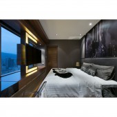
PRODUCTION / REALIZATION TECHNOLOGY: There was no distinct structural difference for the layout before and after. However, as to better utilize the space, the maid bedroom was expanded into 21 sq. ft. Also, the wall adjacent to the son’s bedroom was extended to increase the practicability of the master bedroom. Besides,dark brown walnut wood,grey wallpaper,black-stee SPECIFICATIONS / TECHNICAL PROPERTIES: This apartment consists of living-dining room, master en suite, son’s bedroom, daughter’s bedroom, maid bedroom, guest bathroom and kitchen, small but complete. Different lighting effects were introduced to blend in a sense of warmth into this cool-coloured design and create clear spatial hierarchies. Also, the designer set different LED lightings in the light troughs, highlighting dark colours by multiple sources of light to create splendid visual effects and atmosphere. By adopting digital prints of urban buildings, the metropolitan view outside was extended to the interiors. TAGS: Luxurious home, Hotel style, Buildings, Manhanttan style, architectural, metropolitan, modern, urban scenery RESEARCH ABSTRACT: There was a lot of preliminary research before drafting the design. Firstly, meetings with the client and site measurement were necessary for the confirmation of the floor plan. Secondly, large amount of mood photos were found to do comparison in order to choose the most suitable style for the client and to draw 3D renderings. After that, with the help of different suppliers, piles of materials were gathered to show the contrast of texture and made the final decision. CHALLENGE: The designer has put great effort on spatial planning, particularly focused on functionality, so as to optimize space efficiency. Since the apartment was cramped, making it spacious for 7 people to live in comfortably was the biggest challenge in this project. The narrow living-dining room with a large bay window and the application of dark palette throughout the entire apartment would only make the space look smaller. Also, the designer had to eliminate the awkwardness of the maid bedroom located in the middle of the living room and turned it to a stylish existence. ADDED DATE: 2016-09-26 04:15:14 TEAM MEMBERS (1) : IMAGE CREDITS: All Images, Video, Images in PDF: Danny Chiu Interior Designs Limited, 2015 PATENTS/COPYRIGHTS: Copyrights : Danny Chiu Interior Designs Limited |
||||
| Visit the following page to learn more: http://bit.ly/2kMAJM4 | |||||
| AWARD DETAILS | |
 |
City Point Private Residence by Chiu Chi Ming Danny is Winner in Interior Space and Exhibition Design Category, 2016 - 2017.· Press Members: Login or Register to request an exclusive interview with Chiu Chi Ming Danny. · Click here to register inorder to view the profile and other works by Chiu Chi Ming Danny. |
| SOCIAL |
| + Add to Likes / Favorites | Send to My Email | Comment | Testimonials | View Press-Release | Press Kit | Translations |


