|
|
EPSON Europe at Drupa 2016 Exhibition stand by d=3 |
|
|

|
|
| DESIGN DETAILS |
DESIGN NAME:
EPSON Europe at Drupa 2016
PRIMARY FUNCTION:
Exhibition stand
INSPIRATION:
EPSON uses special branding for exhibitions. A blue parallelogram. Next to their logo of course.
This parallelogram-shape was our inspiration for the trees, and the graphic treatment accross the project.
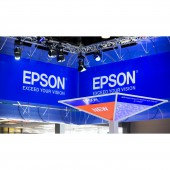
For instance It was used as a tessalation in frosted material on LED backlit walls. And on the trees.
UNIQUE PROPERTIES / PROJECT DESCRIPTION:
EPSON Europe asked us to develop their "home" for 10 days at Drupa 2016. The largest paper and printing exhibition in the world.
The stand should accommodate the different markets EPSON serves, as well as offer space for reception and hospitality.
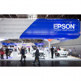
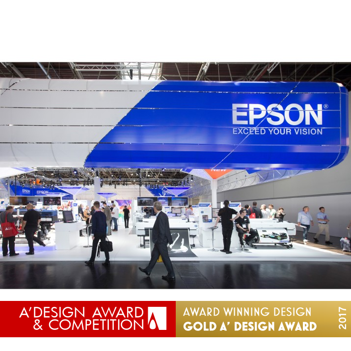
We designed a simple large shape representing and covering the brand. On a lower level we created "trees" clearly identifying the different product areas.
A pleasant clear space with special shapes doing a perfect job for the client.
OPERATION / FLOW / INTERACTION:
Very clear lines of sight and clear definition of each individual product area. The trees performed their role identifying the areas very well and gave a home feeling within the space.
PROJECT DURATION AND LOCATION:
The project started with designing the stand early March 2016. Up until the 30th of May the design was worked on and prepared for production.
The show opened it's doors on the 31st of May in Dusseldorf Germany for the Drupa 2016 ending on the 10th of June 2016.
FITS BEST INTO CATEGORY:
Interior Space and Exhibition Design
|
PRODUCTION / REALIZATION TECHNOLOGY:
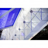
The umbrella-shape consists of poly-carbonate hollow core sheet suspended from a very light-weight aluminium tensile construction. This was needed to meet the very limited weight-load for the ceiling of the hall in Dusseldorf. Hollow sheet is repeated in the tree-fillings and in backlit seperation walls.
Professional lighting company helped accentuate the sleek lines of the design. Furniture is kept simple and mainly made of high gloss white melamine. Also designed for re-use in forthcoming projects.
SPECIFICATIONS / TECHNICAL PROPERTIES:
Floorsize 28 m x 29,5 m totalling 826 m2
Maximum height set by organiser at 6 m
TAGS:
blue, tree, facade, big idea, simplicity, shelter, brand presence
RESEARCH ABSTRACT:
Design based on budget, physical limitations and client brief of course.
Quite a lot of research went into the limitations of the weights hanging from the ceiling. The poly-carbonate hollow core sheet was used in a technically creative way.
CHALLENGE:
Getting suspended weights within the limitations of the building.
The client loved the big idea from the beginning. Quiet a lot of time was spent on arranging products within available space without blocking sightlines and clarity for the visitor.
ADDED DATE:
2016-09-15 10:00:21
TEAM MEMBERS (5) :
D. Dyminska, T. Veltum, D. Hielkema, F. Koudijs and T. Wittebol
IMAGE CREDITS:
Hans Roggen
PATENTS/COPYRIGHTS:
d=3 B.V.
|
| Visit the following page to learn more: http://goo.gl/qgGRna |
|
| CLIENT/STUDIO/BRAND DETAILS |
 |
NAME:
Epson Europe
PROFILE:
Since it was founded more than 70 years ago Epson has continued to produce innovative products and services based on its efficient, compact and precision technologies. As embodied by their "Exceed Your Vision" corporate tagline, they have focused their corporate ethos of creativity and challenge on exceeding the expectations of their customers around the world with the ultimate aim of becoming an indispensable company for both customers and for society in general.
Epson operates in the following businesses:
- Printers Business (Home printers, business printers, scanners, SIDM, PC)
- Professional Printing Business (Commercial printers, Industrial inkjet printing systems, commercial compact printers)
- Visual communications Business (Projectors, Smart Eyewear, High-temperature polysilicon TFT LCD panels)
- Wearable Products Business (Wearable products for sports and personal healthcare, Watches, Sensing systems)
- Robotics Solutions Business (Robot systems, IC handlers)
- Microdevices, Other Business (Crystal devices, Semiconductors, Powdered metals, Surface processing)
|
|
|
| COMMENTS |
| Giulia Esposito |
Comment #3867 on December 25, 2022, 8:58 am |
|
I'm amazed by the success of this project. The design of the exhibition stand is truly breathtaking. The use of colors and unique shapes, along with the textures and materials, all come together to create a harmonious and inspiring atmosphere. The overall concept is sophisticated yet inviting, and the details create an atmosphere of modernity and luxury. It's truly a work of art! Kudos to the designer behind this project for a job well done. Congratulations to d=3 for winning the A' Design Award!
|
| Victoria Hill |
Comment #22516 on January 3, 2023, 7:04 am |
|
The design 'EPSON Europe at Drupa 2016' by d=3 is truly remarkable. It is a perfect example of clever use of resources to create an exhibition stand that is both visually captivating and purposeful. The use of a simple large shape to represent and cover the brand is genius, and the “trees” that clearly identify the different product areas is a clever solution that makes the space inviting and user friendly. The clever use of the parallelogram-shape as a tessellation in frosted material on LED backlit walls is particularly eye-catching. The combination of technical creativity and design research that went into the project is truly remarkable. It is a fantastic example of good design and a deserving winner of the Platinum A' Design Award.
|
| Valentina Rossi |
Comment #25700 on January 3, 2023, 8:05 am |
|
This awe-inspiring exhibition stand is a testament to the creative brilliance of the designers - a perfect blend of form and function that creates a captivating visual experience. The clever use of materials and lighting truly brings the space to life and makes a lasting impression.
|
| Patricia Miller |
Comment #28681 on January 3, 2023, 9:03 am |
|
EPSON Europe at Drupa 2016 is a stunningly creative and visually captivating exhibition stand that blends innovative design with effective and efficient use of materials.
|
| Paul Phillips |
Comment #34920 on January 3, 2023, 11:11 am |
|
I'm so impressed by the design of EPSON Europe's exhibition stand at Drupa 2016. The clean, modern shape perfectly embodies the brand, while the 'trees' clearly identify the different product areas. It's an incredibly effective use of space to create a hospitable and inviting atmosphere.
The way d=3 managed to capture the essence of the brand and create a space that successfully catered to multiple markets is really remarkable. It's no wonder they were chosen to receive the A' Design Award for Interior Space and Exhibition Design.
|
| Elena Petrenko |
Comment #39750 on January 3, 2023, 12:50 pm |
|
This award-winning work is a stunning example of modern design, combining form and function in a truly remarkable way.
|
| Chloe Turner |
Comment #41743 on January 3, 2023, 1:34 pm |
|
I'm absolutely in awe of this exhibition stand! The use of the parallelogram shape as the basis of the entire design is incredibly clever and really ties the whole look together. The frosted material and LED backlit walls look so modern and sophisticated and the trees are the perfect finishing touch. This is truly an inspiring exhibition stand that has been expertly crafted to draw attention and create a memorable experience. Congratulations to d=3 for their success in winning the A' Design Award!
|
| Mark Allen |
Comment #42570 on January 3, 2023, 1:55 pm |
|
This incredible award-winning work is an awe-inspiring exhibition stand that truly takes design to the next level. By utilizing a simple large shape to represent and cover the brand and incorporating “trees” to clearly identify the different product areas, this piece is able to make a bold statement without being overwhelming. The use of special shapes and materials, such as frosted material on LED backlit walls and poly-carbonate hollow core sheet, really adds a unique and creative touch that sets this work apart. What's more, the designer was able to successfully work within the limitations of the building and client brief, resulting in an impressive and memorable experience for all viewers.
|
| Elisabeth Clark |
Comment #42618 on January 3, 2023, 1:56 pm |
|
Congratulations d=3 on winning the A' Design Award for your work titled "EPSON Europe at Drupa 2016". Your work is a great example of exceptional design and truly reflects the synergy of your creative talent and technical ability. Your design was inspired by the parallelogram-shape and the graphic treatment, and the research you conducted into the limitations of the weights hanging from the ceiling was evident in the result. The exhibition stand was simple yet effective, clearly identifying the different product areas and providing a pleasant space for reception and hospitality. Your award-winning work is a testament to your commitment to excellence in design, and I am sure that your work will serve as an inspiration to all aspiring designers.
|
| Anna Ivanova |
Comment #66048 on January 4, 2023, 12:48 am |
|
I am delighted to see that d=3 has won the A' Design Award with their work "EPSON Europe at Drupa 2016", a remarkable exhibition stand. It is truly inspiring to witness the high-level of creativity and innovation that has gone into creating this interior space and exhibition design. Well done!
|
|
|
Did you like D=3's Interior Design?
You will most likely enjoy other award winning interior design as well.
Click here to view more Award Winning Interior Design.
Did you like Epson Europe At Drupa 2016 Exhibition Stand? Help us create a global awareness for good interior design worldwide. Show your support for D=3, the creator of great interior design by gifting them a nomination ticket so that we could promote more of their great interior design works.
|
|
|
|
|
|
