AS Offices Mixed Use Building by Xavier Abreu |
Home > Winners > #49407 |
 |
|
||||
| DESIGN DETAILS | |||||
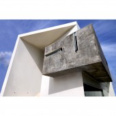
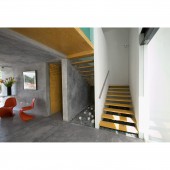
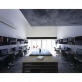
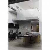
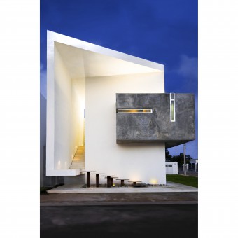
| DESIGN NAME: AS Offices PRIMARY FUNCTION: Mixed Use Building INSPIRATION: The general concept of the project was to design a building that is presented as the firm's signature image, with a contemporary and simple design that comes from a white prism that starts unfolding; truly representing everything that the office lives, and allowing users to enjoy its great spatiality. UNIQUE PROPERTIES / PROJECT DESCRIPTION: The Project consists of an office building that required 3 retail spaces for rent and an architecture workshop. The 15 x 20m land, situated in a corner, forced the design to compact the building in order to get the sufficient parking space required. OPERATION / FLOW / INTERACTION: A three-story building was conceived to contain a mixed-used property that accommodates all the parking spaces and retail area on the ground floor, and the architecture offices on the top ones. The office is organized into two levels, all the services are contained in the exposed concrete cube that opens a window in the vestibule to allow visual amplitude and create a relationship with the outside, the workshop area which is the heart of the office, is a double-height space that opens onto a terrace balcony. The private located on the 2nd level mezzanine opens to the workshop visually, integrating these two areas and allowing this office to enjoy the spatiality of double height and visuals to the balcony. PROJECT DURATION AND LOCATION: Project: 2007 Construction: 2007-2008 Location: Merida, Mexico FITS BEST INTO CATEGORY: Architecture, Building and Structure Design |
PRODUCTION / REALIZATION TECHNOLOGY: Reinforced concrete structure, with a beam and vault ceiling. SPECIFICATIONS / TECHNICAL PROPERTIES: Site: 300 sq. m. Built area: 240 sq. m. TAGS: Architecture, Innovative, Offices, Workshop, Exposed Concrete RESEARCH ABSTRACT: The analysis of orientation and insolation due to the high temperatures in the region, as well as the urban context, were determining factors in the compositional scheme of the project. So the retail area is located with a view to the south because of the street’s heavy traffic flow, and the office’s entrance is located right were the west street is, protecting itself from direct sunlight, and opening onto the east via a glass wall that provides the workshop with natural lighting and great ventilation during day. CHALLENGE: One of the biggest challenges in designing this mixed-use building was to achieve harmony between two elements of different typology because of their function. The office required to reflect a strong image and character, and the retail commercial spaces, being for rent, needed a moderate investment with good looks. ADDED DATE: 2016-06-29 23:10:34 TEAM MEMBERS (1) : Design Direction: Xavier Abreu Sacramento - Alejandra Abreu Sacramento. IMAGE CREDITS: Photographs: Rolando Cordova and Roberto Cárdenas |
||||
| Visit the following page to learn more: http://www.asarquitectura.com/ver.php?id |
|||||
| AWARD DETAILS | |
 |
As Offices Mixed Use Building by Xavier Abreu is Winner in Architecture, Building and Structure Design Category, 2016 - 2017.· Press Members: Login or Register to request an exclusive interview with Xavier Abreu. · Click here to register inorder to view the profile and other works by Xavier Abreu. |
| SOCIAL |
| + Add to Likes / Favorites | Send to My Email | Comment | Testimonials | View Press-Release | Press Kit |

