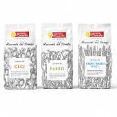
Racconti del Campo Logo, packaging identity by Giacomo Stefanelli and Barbara Cesura |
Home > Winners > #49309 |
 |
|
||||
| DESIGN DETAILS | |||||
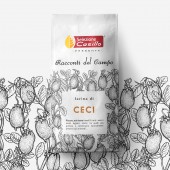
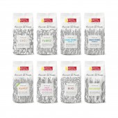
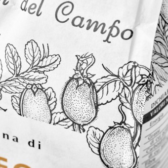
| DESIGN NAME: Racconti del Campo PRIMARY FUNCTION: Logo, packaging identity INSPIRATION: We looked for the answer to this question: what keep all of them together? Which is the common story behing each of them? The most interesting ones came to us considering the origin: a field. Any raw material came from a cultivated field and for sure anyone has its own story, emotions, values and experience to tell! So that we created a name that litterally is "Field stories" and a relative identity treated as a book chain where any single author can tell its story. UNIQUE PROPERTIES / PROJECT DESCRIPTION: It was needed to find a fil rouge, a unique concept, through a range of flours with very different origins: mais, rice, kamut, durum wheat, common wheat, chickpeas, etc. Our client, Selezione Casillo, part of the biggest weath company in Italy, was calling this offer simply as Farine Speciali but it was not differentiating and giving value to the richness of the product. We had to find a concept that would keep all the differences in one single rich soul expressing their values and quality. OPERATION / FLOW / INTERACTION: - PROJECT DURATION AND LOCATION: From February 2015 to October 2015 Client in Corato (BA) south of Italy Agency in Padova (PD) north of Italy FITS BEST INTO CATEGORY: Packaging Design |
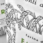
PRODUCTION / REALIZATION TECHNOLOGY: White kraft paper bags printed on the rough side and matched with a PE transparent film. Printed with 7 colors. Main two Pantone 6 U black, one for the illustatrions and one for the text. The remaining colors used for informaive icons. SPECIFICATIONS / TECHNICAL PROPERTIES: 25cm hight x 10 cm long x 7,8cm depht TAGS: flour, packaging, identity, design, field, branding, Italy RESEARCH ABSTRACT: As per our methodology we worked to look for a concept that could express the difference, the uniqueness of the flours range. During the study of all the informations we looked for the concept that was able to keep all these differences together. We found it into the fields where the raw material grow. Each field has its own story to tell and each field let the material grow developing their own personality, richness, values and uniqueness. This was what we needed and we express it inventing and imagining a book where the story is told. The packaging with the product inside is the best book. CHALLENGE: Found the concept that would have kept such different product and flours together in an interesting, unique and differentiating way. ADDED DATE: 2016-06-28 15:13:26 TEAM MEMBERS (4) : Creative Director: Barbara Cesura, Creative Director: Giacomo Stefanelli, Client Director: Stefano Giuseppe Dell'Orto and Illustrator: Durante Marina IMAGE CREDITS: Photos made by Studio Chilesotti Illustrations made by Durante Annalisa and Marina Photo retouch made by Giacomo Stefanelli Front & Back text by Mauro Marinoni |
||||
| Visit the following page to learn more: http://bit.ly/2ka8F1V | |||||
| AWARD DETAILS | |
 |
Racconti Del Campo Logo, Packaging Identity by Giacomo Stefanelli and Barbara Cesura is Winner in Packaging Design Category, 2016 - 2017.· Read the interview with designer Giacomo Stefanelli and Barbara Cesura for design Racconti del Campo here.· Press Members: Login or Register to request an exclusive interview with Giacomo Stefanelli and Barbara Cesura. · Click here to register inorder to view the profile and other works by Giacomo Stefanelli and Barbara Cesura. |
| SOCIAL |
| + Add to Likes / Favorites | Send to My Email | Comment | Testimonials | View Press-Release | Press Kit |
Did you like Giacomo Stefanelli and Barbara Cesura's Packaging Design?
You will most likely enjoy other award winning packaging design as well.
Click here to view more Award Winning Packaging Design.


