DESIGN NAME:
Fashion Mixture
PRIMARY FUNCTION:
Restaurant
INSPIRATION:
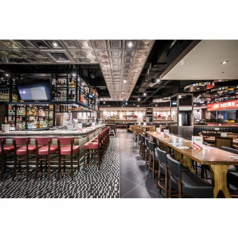
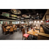
TGI Fridays is situated on the Linsen North Road, the area of heavy traffic and confusion noises, and it is built on the ground and second floor in a composite mall. The inner space includes bar, open kitchen and dining area, extending the spirits of FRIDAYS. The designer fulfills the restaurant with colorful and bright America country style, presenting the atmosphere of putting people at ease and relaxed.
UNIQUE PROPERTIES / PROJECT DESCRIPTION:
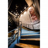
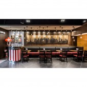
We can see a large forged staircase when coming into the restaurant through a separate entrance. The black bricks and ceiling, the cultured-stone wall, and dangling lights, present one of a kind porch area. On the other side of the seating area, creates the sedate and fashioned lobby atmosphere on the limited-space first floor by using black and red couch and chairs, dark wood veneered wall, and the painting of skyscrapers.
OPERATION / FLOW / INTERACTION:
The designer fulfills the restaurant with colorful and bright America country style, presenting the atmosphere of putting people at ease and relaxed.
PROJECT DURATION AND LOCATION:
The project finished in May 2016 in Taipei city.
FITS BEST INTO CATEGORY:
Interior Space and Exhibition Design
|
PRODUCTION / REALIZATION TECHNOLOGY:
By using the iron products, wooden materials, glass, mirrors, cultured stones, and furniture, the designer ingeniously presents the abundant and composite quality. The design skills connect the interactive relationship between human and space, making the restaurant become the major role integrating employees’ passion and clients’ smile.
SPECIFICATIONS / TECHNICAL PROPERTIES:
556 square meters
TAGS:
Restaurant
RESEARCH ABSTRACT:
TGI Fridays is situated on the Linsen North Road, the area of heavy traffic and confusion noises, and it is built on the ground and second floor in a composite mall. The inner space includes bar, open kitchen and dining area, extending the spirits of FRIDAYS.
CHALLENGE:
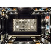
The main colors, in the wide dining area, are red, black, and brown. Using the same design ideas on the first floor, the designer puts the long couch which is close to wall and structural column. On the other hand, the different square, round, and long tables are installed on the same area. The varied table-and-chair sets, with the round mirrors on the ceiling, endow the space rich in fun and changes.
ADDED DATE:
2016-06-27 08:51:48
TEAM MEMBERS (1) :
Ming-Sheng Liang
IMAGE CREDITS:
Architect Liang & Sheng-Yuan lnterior Design
|
