Liberation Residential House by ARMIN CHENG |
Home > Winners > #49119 |
 |
|
||||
| DESIGN DETAILS | |||||
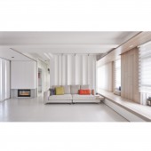
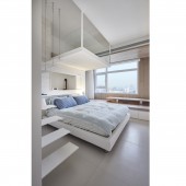
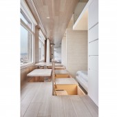
| DESIGN NAME: Liberation PRIMARY FUNCTION: Residential House INSPIRATION: The sunlight that constantly changes its angle and strength with time brings active emotion for the interior space as well as increases the visual warmness. A fresh psychological feeling could be brought to the user by extending the line of vision and seeing the residential environment from a different angle. UNIQUE PROPERTIES / PROJECT DESCRIPTION: The floor plane of this case is neither upright nor foursquare and is single-sided daylighting. We abandoned the traditional thinking toward layouting and partitioning and adopted a measure of flexible partition to make the space open and bright. Among which, the small mezzanine in the kids' room and the long passageway outside the rooms built along the lighting window were designed concisely to create a free and joyful atmosphere for the owner's living space. OPERATION / FLOW / INTERACTION: The interior designer not only abandoned the stereotype of thinking which incorporates only one door for one room and created a more transparent indoor landscape, also created a 150cm-wide "light corridor the sunlight is able to go deeper into the house. These rooms have no partition wall toward the light corridor but with just sliding doors or curtains to protect the privacy. The elevated platform could also functions as a space for parents and children's lying and playing on it, which conceals huge drawers to expand the storage space of the house. PROJECT DURATION AND LOCATION: The project started in August 2014 and finished in October 2014 in Taipei, Taiwan. FITS BEST INTO CATEGORY: Interior Space and Exhibition Design |
PRODUCTION / REALIZATION TECHNOLOGY: While the residential building was being built, we requested the construction company to adjust all interior partition walls. The wall facing the lighting window was also cancelled to widen the space as well as bring the sunlight deeper inside. The three rooms and the living room were moved backward by 150 cm to create a passageway and the elevated wooden platform provides sitting and storage function. According to the young parents request, a mezzanine of 1.5m height was built in the kids' bedroom utilizing the 3.5m interior net height, where the kids could hide and play toys. SPECIFICATIONS / TECHNICAL PROPERTIES: Other decorative elements were purposely reduced to a minimum in order to keep the fun of lighting change. White is adopted as the main color that goes with warm wooden texture and all software and hardware design are sought for the simplest modeling. For example, the small mezzanine and the staircase were successfully built by using merely steel plates and cables embedded into the wall. Even for expressing the image of woods, it was achieved by making abstract vertical grooves on the doors of cabinets. The concave design of the wall behind the couch in the living room is to capture the shadow of light in different times. TAGS: Interior, Design, House, Residence, Simple, Light, Usability, white, Storage RESEARCH ABSTRACT: All the large openings on the inner walls in the whole house were modified in advance by requesting the construction company at the time the building is under construction. A small window on the wall of the kids' room was purposely opened to provide the line of sight and the path for daylight penetration. The location of this small window was decided according to the lighting changes observed on site during different times. Therefore we opened a window on the wall so that the sunlight could go deeper to the passageway and other area. CHALLENGE: We attempted to use the most concise measure, the simplest modeling to achieve the best performance that express the splendidness of the space interacting with the users. ADDED DATE: 2016-06-24 10:16:08 TEAM MEMBERS (1) : IMAGE CREDITS: Hey! Cheese photography Studio |
||||
| Visit the following page to learn more: http://indot.pixnet.net/blog | |||||
| AWARD DETAILS | |
 |
Liberation Residential House by Armin Cheng is Winner in Interior Space and Exhibition Design Category, 2016 - 2017.· Press Members: Login or Register to request an exclusive interview with ARMIN CHENG. · Click here to register inorder to view the profile and other works by ARMIN CHENG. |
| SOCIAL |
| + Add to Likes / Favorites | Send to My Email | Comment | Testimonials | View Press-Release | Press Kit |


