Solunto - panificio e ristorante Hospitality Design by Dopamine Design |
Home > Winners > #48327 |
 |
|
||||
| DESIGN DETAILS | |||||
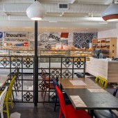
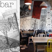
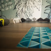
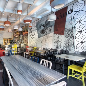
| DESIGN NAME: Solunto - panificio e ristorante PRIMARY FUNCTION: Hospitality Design INSPIRATION: Mediterrean colors and flavors, decorative tiles and a eclectic style were the main inspiration factors. The project started with the idea to create 3 different experiences in a small space: Bakery and coffee bar on one side, pizza and restaurant in the middle and wine bar on the other side. All the materials and design are going back to this concept and tell the story about a brief journey through the 5 senses and european culture. UNIQUE PROPERTIES / PROJECT DESCRIPTION: Solunto Bakery and Restaurant is a fun example of eclectic design inspired by mediterranean colors and flavors. The use of sustainable materials is well balanced with custom design elements such as furniture and original graphics. The Design is fresh and spaces are well thought bringing a new experience in the center of Little Italy in San Diego. OPERATION / FLOW / INTERACTION: The idea was to re-create a small European piazza where people can find whatever they need for the day: fresh bread, a fine lunch and a glass of wine. We wanted to play with different graphics, floor patterns, and colorful decorative tiles to differentiate the three experiences. PROJECT DURATION AND LOCATION: The project started in April 2015 and finished in March 2016. 1643 India Street - San Diego - CA, 92102 FITS BEST INTO CATEGORY: Interior Space and Exhibition Design |
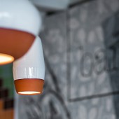
PRODUCTION / REALIZATION TECHNOLOGY: Recycled FireclayTile, reclaimed oak wood, marble counter tops, terra-cotta lighting, hex floor tiles, bok modern facade. SPECIFICATIONS / TECHNICAL PROPERTIES: The space with dining room, kitchen, bakery and service areas is around 5000 square feet TAGS: italian restaurant, bakery, pizzeria, wine bar, italian heritage, sustainable design RESEARCH ABSTRACT: Solunto Bakery and Restaurant is a fine example of eclectic design inspired by mediterranean colors and flavors. The use of sustainable materials is well balanced with unique design elements, custom furniture, original graphics and awarded brands. The Design is fresh and spaces are well thought bringing a a new experience in the center of Little Italy in San Diego. CHALLENGE: The hardest part was getting all the permits especially for the new facade. ADDED DATE: 2016-03-30 23:26:23 TEAM MEMBERS (3) : "Designer: Serena Zanello", "Designer:Daniel Veiga" and "Graphic Designer: Sara Gori" IMAGE CREDITS: Photo by Daniel Veiga and Adam Harrington |
||||
| Visit the following page to learn more: http://www.dpmndesign.com | |||||
| AWARD DETAILS | |
 |
Solunto-Panificio E Ristorante Hospitality Design by Dopamine Design is Winner in Interior Space and Exhibition Design Category, 2015 - 2016.· Press Members: Login or Register to request an exclusive interview with Dopamine Design. · Click here to register inorder to view the profile and other works by Dopamine Design. |
| SOCIAL |
| + Add to Likes / Favorites | Send to My Email | Comment | Testimonials | View Press-Release | Press Kit |

