Levels Contracting Branding Corporate Identity by Milk Design Studio |
Home > Winners > #47237 |
 |
|
||||
| DESIGN DETAILS | |||||
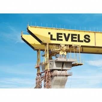
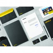
| DESIGN NAME: Levels Contracting Branding PRIMARY FUNCTION: Corporate Identity INSPIRATION: The depth behind all of these levels is the reasoning behind the identity. Although its one of the most popular fields, contracting companies in Saudi Arabia are not showcased enough. Diversity behind architecture growth and development needed to be represented in a simple format with a strong message. The minimal systemized level structure was then connected to a bold yellow color choice to appeal to multiple audiences due to the levels behind each project. UNIQUE PROPERTIES / PROJECT DESCRIPTION: The branding of Levels Contracting Est. was crucial due to its diverse industrial operations in Saudi Arabia. What makes this identity unique is its minimal charm in being subtle yet impactful simultaneously. The strategic cutoff on the main letter, symbolizing levels of progress, in relation to the two tactical slashes with its contrasting colors represent the endless possibilities that this company has to offer with its team of multinational engineers and architects. OPERATION / FLOW / INTERACTION: Due to the complexity behind contracting, the audience needed to interact with the brand quickly. Levels needed to be easily recognizable. The colors used automatically require the viewers to be alert of the projects. An entire space covered in copious amounts of black and yellow raises curiosity and will expand their clientele. Levels also has an emotional connection with its audience because of its local presence. People witnessing their neighbourhoods improving will make them respect the brand. PROJECT DURATION AND LOCATION: Levels started in October 2014 with research and analysis. Focusing on their competitors and how to make them stand out locally with a loud identity. The project finished in April 2015 and major banners and strategic color blocking techniques started being placed throughout the city of Jeddah for periods of times while projects were in progress. |
PRODUCTION / REALIZATION TECHNOLOGY: After researching architectural techniques and geometrical balance, the main objective was to be striking, prominent, and vivid using design elements that complimented the field at hand. This objective lead to the main letter of the brand to have an architecturally inspired cutoff which creates a never ending theme of levels. This technique and method is most relevant when it comes to the balanced way finding system with its minimal illustrations representing everything on site. SPECIFICATIONS / TECHNICAL PROPERTIES: The technical dimensions would be the banners that would wrap around the entire site which would be a minimum of 500m x 500m. TAGS: Branding, Identity, Construction, Corporate, Levels, Milk Branding Agency, Saudi Arabia RESEARCH ABSTRACT: The type of research started with architectural techniques and geometrical balance. The main research objective was to go through books and articles relating to contracting and the scale of space. This again led to the minimal L cutoff speaking volumes to what Levels is. Our data collection showed that less is more and using space wisely will get the job done. This is clearly shown in the relationship between black and yellow. The result was a bold straightforward approach that is persuasive. CHALLENGE: The hardest part of this design was to appeal to an international and local level at the same time. In Saudi Arabia, this minimal approach in English might not be as convincing to all fields such as government projects. In order to overcome this problem, we realized that everyone responds to color. Large spaces of contrasting colors with a bold icon will get anyone talking and asking questions. This technique was a success and Levels has a eclectic clientele due to its brand positioning. ADDED DATE: 2016-02-28 18:09:37 TEAM MEMBERS (4) : Mahmoud Naseem: Creative Director, Alaa Tameem: Art Director, Alaa Qadi: Senior Graphic Designer and Haifa Kattan: Graphic Designer IMAGE CREDITS: Milk Design Studio, 2015. |
||||
| Visit the following page to learn more: http://bit.ly/1VpIanl | |||||
| AWARD DETAILS | |
 |
Levels Contracting Branding Corporate Identity by Milk Design Studio is Winner in Advertising, Marketing and Communication Design Category, 2015 - 2016.· Press Members: Login or Register to request an exclusive interview with Milk Design Studio. · Click here to register inorder to view the profile and other works by Milk Design Studio. |
| SOCIAL |
| + Add to Likes / Favorites | Send to My Email | Comment | Testimonials | View Press-Release | Press Kit |


