Zen Sushi Japanese restaurant by Carlo Berarducci Architecture |
Home > Winners > #46594 |
 |
|
||||
| DESIGN DETAILS | |||||
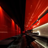
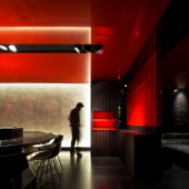
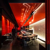
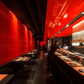
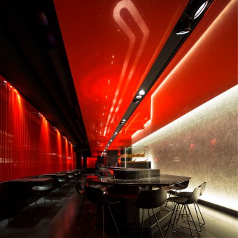
| DESIGN NAME: Zen Sushi PRIMARY FUNCTION: Japanese restaurant INSPIRATION: The project for this kaiten sushi restaurant is inspired by the walkways in the forest bordered by the succession of matt black and glossy red-orange wooden portals, which lead to the temples of Fushimi Inari in Kyoto, of which reproduces colors and suggestions. The dynamism of the kaiten, the peculiar revolving tape carring on sushi on coloured plates that customers can take directly from their seats, suggested to emphasize the dynamic dimension of the space with straights lines and the rhythm of close vertical elements inspired by those of Fushimi Inari. UNIQUE PROPERTIES / PROJECT DESCRIPTION: The project is thought as a process, or what Le Coubusier whould have called an "architectural promenade", rather than a simple decor of the interior. Conceived with the Fushimi Inari walkways in mind, the environment is thought as a succession of steps and changes of direction, rhythmed by the obsessive repetition of the vertical elements, that gradually reveals the space of the restaurant. To each change of direction corresponds a subsequent opening that invites to continue exploring the space and reach the bottom of the narrow and long environment. OPERATION / FLOW / INTERACTION: : Entering the main room with the kaiten in the middle the long straight lines of the suspended ceiling drive the eyes towards the back of the restaurant, before a second choise seating area, where you are attracted to discover a separate, like inflamed, red space. The attention was focused to let each seat to have a pleasant view towards the space and the people all around, or toward rich and reflective surfaces of marble or mirror, while seated an confortables benches. PROJECT DURATION AND LOCATION: : Entering the main room with the kaiten in the middle the long straight lines of the suspended ceiling drive the eyes towards the back of the restaurant, before a second choise seating area, where you are attracted to discover a separate, like inflamed, red space. The attention was focused to let each seat to have a pleasant view towards the space and the people all around, or toward rich and reflective surfaces of marble or mirror, while seated an confortables benches. FITS BEST INTO CATEGORY: Interior Space and Exhibition Design |
PRODUCTION / REALIZATION TECHNOLOGY: The strategy followed was to leave the existing environment structure together with the existing installations quite unchanged, painting them completely black. Inside the new dark box the attention was focused on a few elements that could strongly characterize the space, recalling the suggestions of Kyoto. Red lacquered pvc ceilings, balck and red timber wall coverings, black marble walls and a rice paper backlit wall, are like suspended inside the dark environment. SPECIFICATIONS / TECHNICAL PROPERTIES: The gross internal surface of the whole restaurant including kitchen and services is about 350 sqm, while the net floor area of the dining area is 250 sqm, distributed along a narrow and long environment with the entrance from one of the smaller side and no other windows than the ones on the entrance side. The restaurant could seat 30 people around the kaiten sushi bar, 12 people on tables for two close the sushi bar, plus other 48 on tables for 2, and 4 that could freely combined in the back rooms. TAGS: Restaurants, Japanese restaurnats, Rome restaurants, Japanese restaurants in Rome, design restaurants, new restaurants RESEARCH ABSTRACT: Screens and wall coverings formed by the close succession of hundreds of matt black and glossy red vertical elements drive and mark the going throw, while polished red orange ceilings identify the different areas of the hall, the sushi bar and the tables rooms emphasizing long visual perspectives. Finally two rich natural black marble walls are the backdrop to the entrance area and the room with the tables in the back and a rice paper backlit wall, remember of the paper lights all around the temples in Kyoto, underlines the central focus of the restaurant, the Kaiten and the open workstation of the sushi master. CHALLENGE: The design challenge was how create a japanese feeling in a contemporary way, and how express the dynamic dimension of the kaiten. The project search was to find some of the most impressive images coming back to memory from Japan and reproduce its essence without copy them. The colors and sensations of the temples of Kyoto, especially the contrast between matt balck and polished red, the paper lights all around the temples and the ultra polished surfaces of the lacquered objects, together with the dynamic experience of the walkways in the forest have been abstracted and reproduced in a contemporary way. ADDED DATE: 2016-02-26 10:31:34 TEAM MEMBERS (1) : IMAGE CREDITS: Fernando Guerra, FG+SG PATENTS/COPYRIGHTS: Carlo Berarducci Architecture |
||||
| Visit the following page to learn more: http://www.berarducciarchitecture.com/se |
|||||
| AWARD DETAILS | |
 |
Zen Sushi Japanese Restaurant by Carlo Berarducci Architecture is Winner in Interior Space and Exhibition Design Category, 2015 - 2016.· Press Members: Login or Register to request an exclusive interview with Carlo Berarducci Architecture. · Click here to register inorder to view the profile and other works by Carlo Berarducci Architecture. |
| SOCIAL |
| + Add to Likes / Favorites | Send to My Email | Comment | Testimonials | View Press-Release | Press Kit |

