Project Scope Website by Pawel Malenczak |
Home > Winners > #46480 |
 |
|
||||
| DESIGN DETAILS | |||||
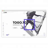
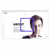
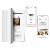
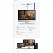
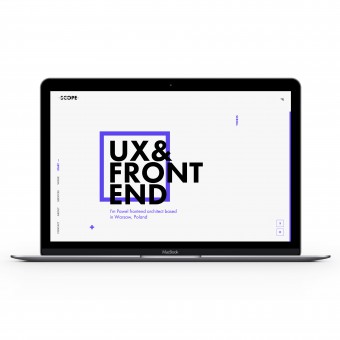
| DESIGN NAME: Project Scope PRIMARY FUNCTION: Website INSPIRATION: As a freelance frontend architect I was in need of creating my professional portfolio website in order to build online presence, showcase selected projects and attract new clients. The key objective of the project was to create a unique yet simple website that would express creativity and professionalism. It was crucial to find a way to make modern technologies and flat layout play in harmony in order to communicate my values to potential clients and coworkers. UNIQUE PROPERTIES / PROJECT DESCRIPTION: Project Scope is a profesional portfolio website for Pawel Malenczak, frontend architect and developer. It features custom grid system that enables me to present portfolio in a unique fashion and make the website work well across different screen resolutions and devices at the same time. My primary goal was to design and develop the possible highest quality of the interface both technically and visually, so that it looks fresh, sharp and crisp, is easy to navigate and understand. OPERATION / FLOW / INTERACTION: Project Scope is designed as responsive one page website with several microsites presenting case studies. While scrolling users can access different sections of the home page and trigger given visual effects. To access microsites and read case studies users can navigate between selected projects by sliding images in work gallery or clicking arrows. User interface changes when displayed in mobile devices in order to provide the best user experience and improve content readability. PROJECT DURATION AND LOCATION: The project started on 15th July 2015 with brand redesign process. New brand and visual communication was followed by web design and development, completed in September 2015 in Warsaw, Poland. |
PRODUCTION / REALIZATION TECHNOLOGY: In order to reflect minimalistic layout and enhance user experience the website was developed with use of HTML5. Layout structure is based on a custom fully responsive grid system which adapts easily to different screen resolutions. All the visual effects, transitions and animations were developed with the use of CSS3, jQuery and animated SVG elements. My primary goal was to keep high quality of the interface, including images, icons, buttons and texts, and make it look sharp on any screen. SPECIFICATIONS / TECHNICAL PROPERTIES: Custom, fully responsive and full-width grid system that supports standard and HD screens as well as modern tablets and smartphones. Layout is HTML5-based and includes multiple transitions and animated SVG elements. Website supports most of the major desktop and mobile browsers, especially Chrome, Firefox, Safari, Opera and Internet Explorer 10, 11. Content of the website can be easily managed with Jekyll CMS. TAGS: portfolio, one-page website, flat design, minimal, clean, modern, responsive RESEARCH ABSTRACT: I began with researching different ways of online presence suitable for a freelancer. I analyzed websites, communication and visual identity of the most successful professionals and agencies in creative industry. While looking for a fresh inspiration I discovered that the most outstanding cases had only one thing in common - no benchmarking. Instead of looking for already existing solutions I turned my attention to art and started to look for a unique experience. I figured that the only way to stand out is to break rules. CHALLENGE: One of the most challenging task for a web designer is to design his/her own portfolio website. Probably most of the designers would share a very similar experience of striving for excellence while working on a product that should reflect their skills and values. Changing approaches, concepts and viewpoints, experimenting and constant looking for the ultimate solution opened my mind for new areas of creativity. Breaking rules is not as easy task as it seems. ADDED DATE: 2016-02-25 18:54:46 TEAM MEMBERS (1) : Pawel Malenczak IMAGE CREDITS: Pawel Malenczak, 2015. PATENTS/COPYRIGHTS: Copyrights belong to Pawel Malenczak, 2015. |
||||
| Visit the following page to learn more: http://www.projectscope.eu/ | |||||
| AWARD DETAILS | |
 |
Project Scope Website by Pawel Malenczak is Winner in Website and Web Design Category, 2015 - 2016.· Press Members: Login or Register to request an exclusive interview with Pawel Malenczak. · Click here to register inorder to view the profile and other works by Pawel Malenczak. |
| SOCIAL |
| + Add to Likes / Favorites | Send to My Email | Comment | Testimonials | View Press-Release | Press Kit |
