DESIGN NAME:
Times/Peanut
PRIMARY FUNCTION:
Free Reading Space
INSPIRATION:
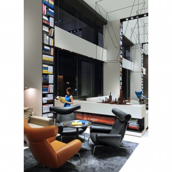
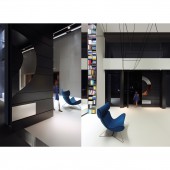
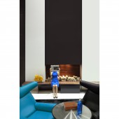
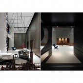
This space was originally a double-story store. After the reconstruction however, it was intergraded into one whole longitudinal space. The three-dimensional composition is the core design of this space. Applying graphic designs onto a three-dimensional space, it combines fun and art in a very dynamic way, showing a visual sense of illusion and novelty. By resolutely discarding the former decorative materials, it has turned the space into a carrier of colours. The well performance of the colours concentration also has contrastively produced certain rhythmical effects. From the overall space up to every detail, everything sparkles gloriously.
UNIQUE PROPERTIES / PROJECT DESCRIPTION:
This space was originally a double-story store. After the reconstruction however, it was intergraded into one whole longitudinal space. The three-dimensional composition is the core design of this space. Applying graphic designs onto a three-dimensional space, it combines fun and art in a very dynamic way, showing a visual sense of illusion and novelty.
OPERATION / FLOW / INTERACTION:
site inspection to explore the max possibility of the space; based on cost, budget, engineering schedule etc. to conduct preliminary design and select a right way, to realize low cost for all the material applied, which is easy for construction and installation, creating a relax, clean and comfortable environment.
PROJECT DURATION AND LOCATION:
the design starts from 21st Feb., 2015 in Shanghai and finished on 20th Apr. 2015 in Guangzhou, nearly two months
FITS BEST INTO CATEGORY:
Interior Space and Exhibition Design
|
PRODUCTION / REALIZATION TECHNOLOGY:
the case was originally two-level shops along streets, with space features of short depth and wide length. we integrated the two levels into one entire space to improve its safety and comfortability as well as service efficiency. we also use emulsion paint and bare concrete, metal, glass,epoxy resin self-leveling floor; etc. during the production period. as for technology for design, we use some decoration and modern sense of technology to show the space.
SPECIFICATIONS / TECHNICAL PROPERTIES:
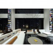
the whole space covers 620m2(width 6.7m* 45m length*8m hight), most furnitures inside are designed for the spaces, including two-level high bookshelf, 9 communication areas, including 9 sets of sofa and tables, all with different dimentions, making the communication more efficient, able to hold nearly 40 people. The office area is located at the back of lounge, 6m width* 38 length, able to accommodate nearly 20 staff.
TAGS:
simple; artistic; rhythm; fun; color; practical;cost-effective;
RESEARCH ABSTRACT:
Before the project, make detailed communication with using party, mainly to undertand their need and purpose as well as the plan for the project
CHALLENGE:
the biggest challenge which costs most time is to understand the need of customers, time schedule, expected commercial purposes, as well as cost and budget, and make a correct design method and thought, and the whole construction time is too limited, but need to use simplist construction method to present a different space perception
ADDED DATE:
2016-02-25 06:51:11
TEAM MEMBERS (1) :
none
IMAGE CREDITS:
none
|


