Silver Salt Corporate Identity by Lesser Fullness Design |
Home > Winners > #46364 |
 |
|
||||
| DESIGN DETAILS | |||||
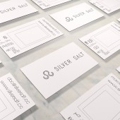
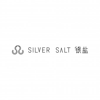
| DESIGN NAME: Silver Salt PRIMARY FUNCTION: Corporate Identity INSPIRATION: The main request from the client was that there should not have any familiar photograph visuals in the logo design, for example, cameras, films, lens and etc. Therefore, it took us plenty of time to fulfill his ambition. It turned out that the bond between analogue and digital age inspires the identity of Silver Salt most. UNIQUE PROPERTIES / PROJECT DESCRIPTION: This project is a full branding case including developing a proper name for a photography studio and also visualizing the concept of the name. For this reason, the challenges were first clarifying the core concepts of the client’s many ideas and then identifying the company with a distinguished picture. Therefore, the designer finally chose the name, Silver Salt, which is with a color, a smell and a history of analog device behind, and designed the logo just creating the icon by the two initial letters. OPERATION / FLOW / INTERACTION: Two diagonal letter S cross at 90-degree form the basic shape of the logo. To indicate the idea of aperture, there are two more incomplete circles inside both the S letter's bottom curve. It turned out that the logo could be recognized either as the sign Leo, which is the sign of the owner, or a necklace S-hook. In terms of the idea of hook, a photo is not only about an image, but a link connecting the light and the shadow, the past and the present, and the memories and the reality. PROJECT DURATION AND LOCATION: The project started in December 2014 and finished in March 2015 in Beijing. FITS BEST INTO CATEGORY: Graphics, Illustration and Visual Communication Design |
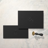
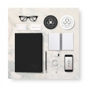
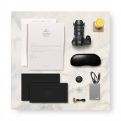
PRODUCTION / REALIZATION TECHNOLOGY: The name, Silver Salt, came up with a light sensitive chemical applied in photographic film before, which satisfied the analog atmosphere the client wished to present. Then we decided to use only these two symbolic s letters to make the shape. In order to relate the logo with the founder to some extent closely, the visualization was also influenced by the owner’s star sign, Leo. SPECIFICATIONS / TECHNICAL PROPERTIES: Corporate Identity; It is an efficient way to present a graphic project by 3D mockups, and it's also economical for the client. An animated logo reel also helps the client quickly understand the idea behind the design. TAGS: Lesser Fullness Design, Silver Salt, photography studio Identity, RESEARCH ABSTRACT: The final name, Silver Salt, came from a photography theory book with other 20 names inspired from technology, skills, jargon, historical events, famous pictures, chemicals, and theories. For the visual part, we would like to find an iconic way to present the logo even without showing the name, and it should be applied on at least stickers, stamps, cards, letterhead, and online avatars. So basically we did research in Chinese and Japanese pattern design, and certainly geometry. CHALLENGE: The most exciting and challengeable part of this project for us was that there was nothing at all at the very beginning. There was no name for the company, no recommended precedents from the client, no detailed business plan, nothing but beautiful visions. Not to be surprised, this situation will always happen in the branding progress. And we learned that it’s hard for the clients to describe what they really want the logo to be look like unless you show them. ADDED DATE: 2016-02-25 04:02:11 TEAM MEMBERS (2) : Concept and graphic designer: Yina Ma and 3D mockup designer: Yihan Liang IMAGE CREDITS: Image #2: 3D Mockup Yihan Liang Image #3: 3D Mockup Yihan Liang Image #3: 3D Mockup Yihan Liang Image #4: 3D Mockup Yihan Liang Video Credits: Yihan Liang PATENTS/COPYRIGHTS: Copyrights belong to Lesser Fullness Design, 2015 |
||||
| Visit the following page to learn more: http://t.cn/R4qFB3S | |||||
| AWARD DETAILS | |
 |
Silver Salt Corporate Identity by Lesser Fullness Design is Winner in Graphics, Illustration and Visual Communication Design Category, 2015 - 2016.· Press Members: Login or Register to request an exclusive interview with Lesser Fullness Design. · Click here to register inorder to view the profile and other works by Lesser Fullness Design. |
| SOCIAL |
| + Add to Likes / Favorites | Send to My Email | Comment | Testimonials | View Press-Release | Press Kit |

