DESIGN NAME:
Colour Youth
PRIMARY FUNCTION:
Branding
INSPIRATION:
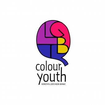
The inspiration came from the meaning of communication. LGBTQ community is an open group ready to talk and expose themselves in order to show their effort. The speech bubble (icon) is consisted by a typographic synthesis of the letters L, G, B, T that stand for Lesbians, Gay, Bi and Trans. The form of the speech bubble is the letter Q from the word Queer (:an umbrella term for sexual and gender minorities). The forms of the letters also show a fist to present the united character of the team.
UNIQUE PROPERTIES / PROJECT DESCRIPTION:
This is our entry to the Young Lions Competition Hellas.
It won the first award and sent us to Cannes Lions International Festival. The logo is for 'Colour Youth', an NGO defending the rights of the greek LGBTQ community.
Designed with free-hand sketched lines and fonts to indicate the young and modern character of this community.
Fresh colors have been used to remind the lgbtq flag but also be different from it.
"Being different is a colourful choice."
OPERATION / FLOW / INTERACTION:
The logo can be expanded in 4 similar logos to be used separately in the 4 different categories of the LGBTQ community. these categories are: Lesbians that stand for the purple color, Gay with the pink color, Bi for the yellow and Trans for the blue.
PROJECT DURATION AND LOCATION:
Started in in May at Athens and had duration 2 days, because of the deadlines of the competition.
FITS BEST INTO CATEGORY:
Graphics, Illustration and Visual Communication Design
|
PRODUCTION / REALIZATION TECHNOLOGY:
Typography is the main technique we used to give clearly the concept of the logo.
SPECIFICATIONS / TECHNICAL PROPERTIES:
Hand sketched logo in vector format.
It can be used without the name Colour Youth. Stands in big and small dimensions too.
TAGS:
branding, lgbtq community, Athens, Greece, ngo, typography, speech bublble
RESEARCH ABSTRACT:
Research in competitive lgbtq logos and colour palettes.
CHALLENGE:
The deadlines was the hardest aspect of the project. We had to complete the branding in 2 days, research, design and implementations for the final presentation. Also, the too-many lgbtq logos made the competition very hard.
ADDED DATE:
2016-02-24 22:21:16
TEAM MEMBERS (5) :
Client: Color Youth - LGBTQ Community of Athens, Art Directors: Pefani Marianna, Katerina Miliaraki, Designers: Pefani Marianna, Katerina Miliaraki, Illustrators: Pefani Marianna, Katerina Miliaraki and Country: Greece
IMAGE CREDITS:
Client: Color Youth - LGBTQ Community of Athens
Art Directors: Pefani Marianna, Katerina Miliaraki
Designers: Pefani Marianna, Katerina Miliaraki
Illustrators: Pefani Marianna, Katerina Miliaraki
PATENTS/COPYRIGHTS:
Client: Color Youth - LGBTQ Community of Athens
Art Directors: Pefani Marianna, Katerina Miliaraki
Designers: Pefani Marianna, Katerina Miliaraki
Illustrators: Pefani Marianna, Katerina Miliaraki
|


