Signal Ethic Food Allergies Pictograms by Alvaro De Ramon Murillo |
Home > Winners > #45734 |
 |
|
||||
| DESIGN DETAILS | |||||
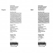
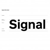
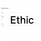
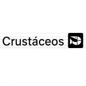
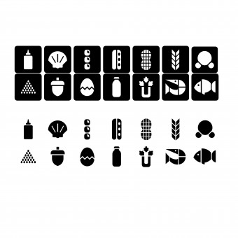
| DESIGN NAME: Signal Ethic PRIMARY FUNCTION: Food Allergies Pictograms INSPIRATION: I was inspired by the AIGA/DOT pictograms (1974-1979) which are very understandable and universal. I also took them as inspiration because, as they were free to use, they have known a global expansion. That mindset of "give for free/become universal" is very similar of the one that I wanted for Signal Ethic. Social Design has to be Open Source and for free. UNIQUE PROPERTIES / PROJECT DESCRIPTION: It is the first pictographic system of Food Allergies to be included in a typeface. It has being tested successfully in almost 100 people from all over the world. It follows the quote of Otto Neurath: Words divide, pictures unite. For improving its understanding and to follow the current laws, it is accompanied by text. This 14 pictograms include the regulations of the UN and EU. This 14 food allergies affect 99 percent of the allergic people in the world. OPERATION / FLOW / INTERACTION: The cool thing about Signal Ethic is the fact that, as the pictograms are integrated in the typography, the user doesn't need to import other files and the pictograms are always at the good size and spacing depending on the type size. This fact enables the user to make restaurant menus, food labelings and other stuff accessible to people with food allergies in less time and with better results of comprehension, as it has being tested in nearly 100 people of the 5 continents and the rate of success has been in average 80 percent. PROJECT DURATION AND LOCATION: The project started in August 2015 in Menorca, Spain and finished in February 2016 in Madrid and was presented in front of the Jury of the Escuela Arte Diez as the graduation project of Alvaro De Ramon Murillo. FITS BEST INTO CATEGORY: Social Design |
PRODUCTION / REALIZATION TECHNOLOGY: Glyphs Mini, Adobe Illustrator CC 2015, Wacom Intros Pen & Touch Small, tracing paper, Micron pens, ruller, pencils, pens, technical drawing material. SPECIFICATIONS / TECHNICAL PROPERTIES: Variable (as it is a typeface), from 8mm x 8mm (the pictograms) to no limitation. TAGS: signage, typography, food, healthcare, allergies, allergy, social, graphic, type RESEARCH ABSTRACT: There are two versions: positive and negative to vary by use and ensure better readability. These can also be varied so used in negative for its use on dark backgrounds. We have made various surveys with Food Allergies and Kids, an NGO which has 20,000 followers on Facebook, with very positive results (rates of understanding of 80 percent in average) This will help 9 percent of the world population according to FARE and UN to prevent accidental intoxications. CHALLENGE: The challenge was to create a pictographic system understandable by almost all the human population, but mostly by food allergic people. it was also a typography that I had to create from the influences of Transport and San Francisco. It has not been easy, since the final version have had to develop almost 20 versions of each allergen with the same care and attention to the latest version. Also, the optical corrections between positive and negative versions have been very hard. ADDED DATE: 2016-02-21 22:40:40 TEAM MEMBERS (1) : Alvaro De Ramon Murillo IMAGE CREDITS: Alvaro De Ramon Murillo, 2015. |
||||
| Visit the following page to learn more: http://www.signal-ethic.org | |||||
| AWARD DETAILS | |
 |
Signal Ethic Food Allergies Pictograms by Alvaro De Ramon Murillo is Winner in Social Design Category, 2015 - 2016.· Press Members: Login or Register to request an exclusive interview with Alvaro De Ramon Murillo. · Click here to register inorder to view the profile and other works by Alvaro De Ramon Murillo. |
| SOCIAL |
| + Add to Likes / Favorites | Send to My Email | Comment | Testimonials | View Press-Release | Press Kit |

