|
|
|


|
|
| DESIGN DETAILS |
DESIGN NAME:
Eyesbound
PRIMARY FUNCTION:
Portfolio Website
INSPIRATION:
The main inspiration came through the photographers imagery. He focuses on architecture and nature motifs with a unique point of view. In preparation for the design, I had a look at several portfolio websites to get a best practice overview. I realized, that the information about the photographer often seems more important than the images. So I focused on the images as a key element.
UNIQUE PROPERTIES / PROJECT DESCRIPTION:
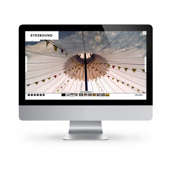
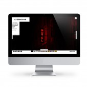
The design focuses on the strong imagery of the photographer and emphasizes this by using full screen images as a main detail. The navigation elements are kept simple and it is possible to hide them, so the images will not be covered by them. The typographic logo is displayed in full screen mode as well but scales down and transparentizes. In order to set the focus on the images, the only used colors are black and white.
OPERATION / FLOW / INTERACTION:
The website can be operated by mouse and keyboard, using arrow keys inside modern browsers. The navigation structure is kept simple, without too many sub pages to the flow flat and the user interested.
PROJECT DURATION AND LOCATION:
The project started in May 2014 in Berlin and went live in August 2014. Since then minor iterations are still in progress to present day.
|
PRODUCTION / REALIZATION TECHNOLOGY:
The web design was created in Adobe Photoshop, Realization Tools: Drupal 7, CSS 3, HTML 5, jQuery
SPECIFICATIONS / TECHNICAL PROPERTIES:
Responsive web page with always-fullscreen imagery and fullscreen mode in supported browsers.
TAGS:
Clean, Easy-to-use, Photography, Simple, Website, Web Design, Portfolio
RESEARCH ABSTRACT:
I browsed several photographers portfolio websites, both, of famous and not yet discovered photographers and filtered design and layout wise for similarities and differences. Many portfolio pages do not have full screen options. I started to focus on the works. My client does not use his own name to publish his photos, we created sort of a brand for the photos. Then I started to look at fashion, furniture and lifestyle brands. They all put the emphasis on the product. In our case the photography becomes the product, at least presentation wise.
CHALLENGE:
The challenge was to find a way to display photography online in a new and unseen way. To do so I needed the full screen mode. The technical realization happened to be difficult, since the website is responsive. It does not work on every browser, older browsers do not support the fullscreen mode.
ADDED DATE:
2016-02-21 11:54:05
TEAM MEMBERS (1) :
IMAGE CREDITS:
Image #1: Photographer: Jannis Hell, Zirkuszelt, 2014.
Image #2: Photographer: Jannis Hell, Ibsens Hotel, 2014.
Image #3: Photographer: Jannis Hell, Shuttered, 2013.
Image #4: Photographer: Jannis Hell, Trockenraum, 2013.
|
| Visit the following page to learn more: http://bit.ly/1XCVbJl |
|
| CLIENT/STUDIO/BRAND DETAILS |
 |
NAME:
EYESBOUND
PROFILE:
Eyesbound Photography is a Berlin based photographer. The focus lies on fine art photography with architecture and environmental images. Founded in 2005, Eyesbound switched from analogue to digital photography, using hdr and infrared techniques as well as extreme bulb exposure.
|
|
|
| COMMENTS |
| Giulia Esposito |
Comment #3106 on December 25, 2022, 4:43 am |
|
I am elated to hear that a portfolio website such as "Eyesbound" has been awarded with the A' Design Award. It is a testament to the creativity and quality of a website and web design that can be achieved to bring a unique experience to the user. It is inspiring to see the attention to detail and the passion that has been put into creating such an amazing work. I look forward to seeing more of this kind of work from Julia Hell!
|
| Paul Williams |
Comment #27608 on January 3, 2023, 8:42 am |
|
Eyesbound has been awarded the A' Design Award for Website and Web Design, and it is easy to see why. The design truly puts the emphasis on the photography, utilizing full screen images as the main detail. The navigation elements are simple and can be hidden to ensure that the images are not covered. The typographic logo appears in full screen mode and scales down and transparentizes. The use of only black and white colors further sets the focus on the images. It is clear that a lot of research and thought has been put into the design, as it is unlike anything that has been seen before. Congratulations to the designer for winning this prestigious award!
|
| Paul Phillips |
Comment #31040 on January 3, 2023, 9:50 am |
|
This portfolio website is a stunning display of the photographer's work. The full screen images used as the main detail are captivating and draw the eye in, while the simple navigation elements are cleverly tucked away so they don't interfere with the images. The typographic logo adds a unique touch while also transitioning smoothly between full screen and smaller sizes. The use of just black and white keeps the focus on the images, creating a beautiful and timeless design. It's no surprise this work won an A' Design Award--it's truly remarkable!
|
| Elena Petrenko |
Comment #35789 on January 3, 2023, 11:29 am |
|
This portfolio website uses full-screen imagery and a simple navigation to emphasize the photographer's work in an exciting and unique way.
|
| Chloe Turner |
Comment #36095 on January 3, 2023, 11:35 am |
|
Seeing this portfolio website was an absolute delight! Every detail was so carefully crafted, making the entire experience so immersive. I was mesmerized by the incredible images that filled the page, they were so captivating that I could barely tear my eyes away. The way the images were used to create a narrative was impressive, and it was clear that a lot of thought went into the design. The photographer's unique point of view was highlighted by the website's design, and it was clear that the images were the focus. Overall, this portfolio website is a stunning example of how design can be used to bring out the best in a photographer's work.
|
| Elisabeth Clark |
Comment #36929 on January 3, 2023, 11:51 am |
|
Wow! I'm so impressed by the work done by Julia Hell! Their design for the Eyesbound portfolio website is incredibly well done, and the award they won is a testament to the skill and creativity behind it. The full screen images are incredibly striking and the typographic logo is a perfect touch. It's easy to see why they won the A' Design Award! Julia Hell has done an amazing job in creating a portfolio website that emphasizes the photographer's strong imagery. The use of black and white colors creates a stunning visual effect that really brings out the photographer's work. The research and preparation that went into the design is evident, and the focus on the images really has made this portfolio website stand out. Congratulations to Julia Hell for their award-winning design!
|
| Mark Allen |
Comment #37280 on January 3, 2023, 11:58 am |
|
This award-winning work is a remarkable portfolio website that puts the focus on the strong imagery of the photographer. The navigation elements are kept simple and the typographic logo is displayed in full screen mode for maximum impact. The only colors used are black and white to draw attention to the photos. This design is a great example of how to display photography online in an innovative and unique way.
|
|
|
Did you like Julia Hell's Web Design?
You will most likely enjoy other award winning web design as well.
Click here to view more Award Winning Web Design.
Did you like Eyesbound Portfolio Website? Help us create a global awareness for good web design worldwide. Show your support for Julia Hell, the creator of great web design by gifting them a nomination ticket so that we could promote more of their great web design works.
|
|
|
|
|
|


