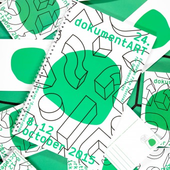
DokumentArt Visual Identity by Amanda-Li Kollberg & Lorenz Huchthausen |
Home > Winners > #45646 |
 |
|
||||
| DESIGN DETAILS | |||||
| DESIGN NAME: DokumentArt PRIMARY FUNCTION: Visual Identity INSPIRATION: The inspiration was the tiny town where the festival takes place. After having been more or less erased during the 2nd World War, the town has had to re-invent itself with the medieval city wall as only remaining frame. The festival reflects that tendency to look forward and let the town be a stage for culture, art, film, theatre and music with an international outlook. Our identity concept was the same, a frame, a stage where anything can happen. UNIQUE PROPERTIES / PROJECT DESCRIPTION: Complete re-design of the identity for German documentary film festival DocumentArt. The project started as a University workshop where our work was chosen to become reality and we will now continue to develop the identity vision for the festival over the upcoming years. The idea was to create a bang, and then remain very continuous, yet playful and experimental and challenge each media, each theme, each year while still not loosing recognizability. OPERATION / FLOW / INTERACTION: The DocumentArt film festival is promoted with billboards, banners and posters in and around the Mecklenburg-Vorpomme PROJECT DURATION AND LOCATION: The project started as a student workshop at Kunsthochshule Weissensee, Berlin, in June 2015 and was later chosen to be realized. We have worked in our home towns Berlin and Copenhagen and on location in Neubrandenburg. The festival took part in Neubrandenburg, Germany in October 2015. FITS BEST INTO CATEGORY: Graphics, Illustration and Visual Communication Design |
PRODUCTION / REALIZATION TECHNOLOGY: We have used Adobe Illustrator, InDesign, Photoshop, Excell and Acrobat Pro and worked on Google Drive to a great extent. We've made an ocean of drawings, hand made dummys and test prints, all material is printed in Germany. SPECIFICATIONS / TECHNICAL PROPERTIES: Custom format catalogue, DIN A6 booklet, DIN Lang folder, A1 and A0 posters plus several ads, banners, postcards and plexiglass awards. TAGS: Visual Identity, Poster, Documentary, Catalogue, Folder RESEARCH ABSTRACT: Research consisted of thorough investigation of the visual and practical history of the festival, as well as the historical context of the venues and town as a whole. We spent time in the city at the beginning of the process to get to know it and see how the town and the storytelling could intertwine. It was important for us to develop a concept that was not just a one-of but could live, develop and grow with the festival. The possibilities of the visual concept is therefore loosely sketched out for the next 4-5 years. CHALLENGE: The festival have existed for 24 years without ever having a consistent identity. They take pride in making each year different from the previous, and asked for an identity that could create recognizability while still being really flexible and open for customization and differentiation over the years. Solving the task therefore also required us making a loose plan for the possible visual developments over the next 4-5 years, and we have right now started the concept development for the festivals 25th anniversary. ADDED DATE: 2016-02-20 09:51:12 TEAM MEMBERS (2) : Lorenz Fidel Huchthausen and Amanda-Li Kollberg IMAGE CREDITS: All documentation footage by Lorenz Fidel Huchthausen. All photo editing by Amanda-Li Kollberg PATENTS/COPYRIGHTS: Copyrights belong to Lorenz Fidel Huchthausen and Amanda-Li Kollberg, 2015 |
||||
| Visit the following page to learn more: http://dokumentart.org | |||||
| AWARD DETAILS | |
 |
Dokumentart Visual Identity by Amanda-Li Kollberg & Lorenz Huchthausen is Winner in Graphics, Illustration and Visual Communication Design Category, 2015 - 2016.· Press Members: Login or Register to request an exclusive interview with Amanda-Li Kollberg & Lorenz Huchthausen. · Click here to register inorder to view the profile and other works by Amanda-Li Kollberg & Lorenz Huchthausen. |
| SOCIAL |
| + Add to Likes / Favorites | Send to My Email | Comment | Testimonials | View Press-Release | Press Kit |


