EROTICA Script font by Maximiliano Rodolfo Sproviero |
Home > Winners > #45633 |
 |
|
||||
| DESIGN DETAILS | |||||
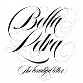
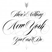
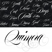
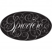
| DESIGN NAME: EROTICA PRIMARY FUNCTION: Script font INSPIRATION: I want to use this space to express my sincere admiration to the fantastic Herb Lubalin, and his friends Tony DiSpigna, Tom Carnase, and of course my fellow countryman Ricardo Rousselot. All of them, amazing. UNIQUE PROPERTIES / PROJECT DESCRIPTION: Erotica follows the essential rules of the Roundhand or Engrossers Script form of calligraphy and take them to the extreme. In this particular style, letters show a lot of personality and sometimes they seem drawn rather than written. The transition from its shades to its thins had to be really smooth to achieve its sensuality. Many alternates, ligatures and variations for each glyph were designed in order to satisfy the needs of the user. OPERATION / FLOW / INTERACTION: This is an open-type programmed font. So, if used in any program which supports it, the user can take a huge advantage of its features. After writing a word, he/she can select a glyph and change it for a more decorative one in the glyphs panel. Also, if some OT buttons are activated, the font changes its glyphs automatically. In example, if the "fi" (liga) is activated, the font will automatically change some pairs of letters when written together. If "fina" is activated, the font will change only the last glyph of the word for a more decorative one. PROJECT DURATION AND LOCATION: The project started in 2012 and was finished in 2013 after having suffered many re-designs. Its proportions were changed a lot till the right one was found. FITS BEST INTO CATEGORY: Graphics, Illustration and Visual Communication Design |
PRODUCTION / REALIZATION TECHNOLOGY: Many glyphs of Erotica were first handmade, especially its decorative swirls. The font is based on the author's own calligraphy: The style is called engrosser's or english round-hand. When digitised, the contrast between thicks and thins were exaggerated to achieve more elegance. SPECIFICATIONS / TECHNICAL PROPERTIES: - TAGS: - RESEARCH ABSTRACT: - CHALLENGE: It's not easy to make a decorative font which works well when 'anything' is written. The challenge of Erotica was to make this work. To do this one has to be concious that although calligraphy is an art, typography is not. So, sometimes the "personal touch" has to be left apart. It is true that Erotica looks very decorative, however, many flourishes had to be abandoned in order to have a more professional result. ADDED DATE: 2016-02-19 22:29:58 TEAM MEMBERS (1) : IMAGE CREDITS: Maximiliano Rodolfo Sproviero, 2015. |
||||
| Visit the following page to learn more: http://www.sproviero-type.com | |||||
| AWARD DETAILS | |
 |
Erotica Script Font by Maximiliano Rodolfo Sproviero is Winner in Graphics, Illustration and Visual Communication Design Category, 2015 - 2016.· Press Members: Login or Register to request an exclusive interview with Maximiliano Rodolfo Sproviero. · Click here to register inorder to view the profile and other works by Maximiliano Rodolfo Sproviero. |
| SOCIAL |
| + Add to Likes / Favorites | Send to My Email | Comment | Testimonials | View Press-Release | Press Kit |


