Exhibition Information Temporary exhibition by Design Studio H2E |
Home > Winners > #45447 |
 |
|
||||
| DESIGN DETAILS | |||||
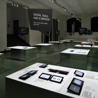
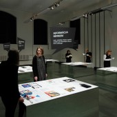
| DESIGN NAME: Exhibition Information PRIMARY FUNCTION: Temporary exhibition INSPIRATION: We thought of the process of how a graphic work is created. For a graphic designer it all starts with a white A4 size sheet. So it was for us. We took a white A4 size sheet, multiplied it 45 times, positioned the exhibition surfaces on a grid network and arranged the objects on them. The texts, black color on white background, were chosen as the purest way for showing the information. The linear design of grey scale elements emphasized the colorfulness of the exhibition content. UNIQUE PROPERTIES / PROJECT DESCRIPTION: Exhibition INFORMATION was dedicated to the graphic design of Latvia and demonstrated 12 different sides of it, e.g. packaging, visual identity, book design etc. It aimed to invite people to explore the diversity of graphic design and to become aware of its significance in every field. Basic principles of the graphic design were the design code of the exhibition. 12 almost levitating surfaces presented 66 graphic design works and let people observe themselves in the scene of graphic design. OPERATION / FLOW / INTERACTION: The levitating surfaces of graphic design formed the first part of the exhibition. The second part, reading zone, provided an insight in the printed media on different design aspects and events in Latvia. The speech bubbles hanged above the tables were communication intermediaries - every bubble had a specific question on it that was also asked to the authors of the works exhibited. These answers were presented on the surfaces next to corresponding work hence a personal connection was made between visitors and graphic designers. PROJECT DURATION AND LOCATION: The project started in January 2015 and finished in April 2015. It was opened to public March - April 2015 in Art Academy of Latvia, Riga, Latvia. FITS BEST INTO CATEGORY: Interior Space and Exhibition Design |
PRODUCTION / REALIZATION TECHNOLOGY: Surfaces of the tables were made of chipboard, mirrors were attached on 4 sides and printouts were placed on top. Three ways of presenting the works were chosen, namely texts and images as printouts, real objects and screen displays with videos. Each table revealed its theme via speech bubbles made of foam board and hung in fluorocarbon lines. The halogen lighting emphasized the whiteness of the surfaces. 2 tables in the reading zone were made of laminated particle board. SPECIFICATIONS / TECHNICAL PROPERTIES: The total area of exhibition was 285 m2 and included a hall of the Art Academy of Latvia. TAGS: Temporary exhibition, Exhibition, Latvian graphic design, Information design, Levitating surfaces RESEARCH ABSTRACT: To mirror the most up to date situation of Latvian graphic design we conducted a research on the topic as our aim was to inform the visitors, both with and without background in graphic design, and to present works that are of good example of graphic design. The works exhibited were only a small fraction of graphic design works created by Latvian designers. Major research was implemented via using specific Internet sites, via talking with specialists in the field (also curators). CHALLENGE: The main challenge was to make the exhibition comprehensible for people who are not directly involved in the field of graphic design yet exciting for those who have background in the field. Also, the design team aimed towards graphically ascetic design which also meant moderate and clever way of choosing the exhibits and the number of them in order to make the exhibition inspiring and educational. ADDED DATE: 2016-02-17 15:21:35 TEAM MEMBERS (5) : Design studio H2E , Curators: Ingūna Elere, Holgers Elers, Barbara Ābele and Dita Danosa IMAGE CREDITS: Image #1: Photographer Ansis Starks, Information, 2015. Image #2: Photographer Ansis Starks, Information, 2015. Image #3: Photographer Ansis Starks, Information, 2015. Image #4: Photographer Didzis Grodzs, Information, 2015. Image #5: Photographer Ansis Starks, Information 2015. Video credits: Fly For Film |
||||
| Visit the following page to learn more: http://www.h2e.lv/?id=286 | |||||
| AWARD DETAILS | |
 |
Exhibition Information Temporary Exhibition by Design Studio H2e is Winner in Interior Space and Exhibition Design Category, 2015 - 2016.· Press Members: Login or Register to request an exclusive interview with Design Studio H2E. · Click here to register inorder to view the profile and other works by Design Studio H2E. |
| SOCIAL |
| + Add to Likes / Favorites | Send to My Email | Comment | Testimonials | View Press-Release | Press Kit |


