Prolat Paints Paint Color Packages by Manos Siganos |
Home > Winners > #44444 |
 |
|
||||
| DESIGN DETAILS | |||||
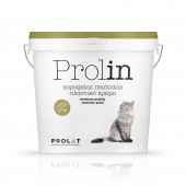
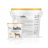
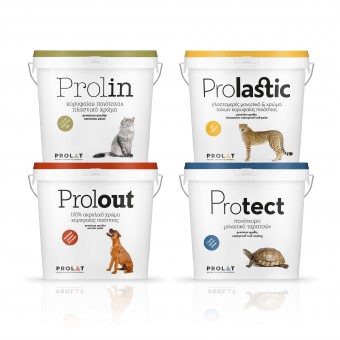
| DESIGN NAME: Prolat Paints PRIMARY FUNCTION: Paint Color Packages INSPIRATION: The project consisted in designing a new line of products from the start and with no restraints whatsoever; this was a challenge and a source of inspiration at the same time. The dominant element in the specific concept is an animal that enjoys the warmth and safety of home along with man, for instance the cat or the dog, or some animal known for its special ability to protect itself, such as the tortoise, or for its flexibility and speed, such as the cheetah. UNIQUE PROPERTIES / PROJECT DESCRIPTION: Packaging for a new wall paints line for PROLAT company. Four different paints that share top quality and a number of features friendly both to man and to the environment. The concept needed an element that would link the ideas of home, protection, nature and man with the distinctive qualities of each paint. Therefore we chose to associate the special characteristics of certain animals with the respective attributes of the paints. The prefix PRO, derived both from the brand name, PROLAT and the abbreviation of the word PROFESSIONAL. OPERATION / FLOW / INTERACTION: These are the cans created for a top quality line of wall paint products for interior and exterior use and for vertical surface insulation. The target market consists of private individuals and professionals who need an eco friendly and odorless material with very good texture that can provide excellent protection. It is easy to use and may be applied easily even by non experts. To ensure appropriate and safe use, explanatory icons had to be created and added to the back of the package. PROJECT DURATION AND LOCATION: The specific project started in January 2016 in Athens and was completed in the same year in April. Many new products derived from this line are also to be designed during 2016. FITS BEST INTO CATEGORY: Packaging Design |
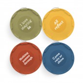
PRODUCTION / REALIZATION TECHNOLOGY: The printing method selected was IML, which is known to offer extraordinary CMYK colour rendition, as well as high raster definition. Each can lid had their own Pantone colour, which was similar to that of their container design. SPECIFICATIONS / TECHNICAL PROPERTIES: The design was applied to plastic cans of various shapes and capacities. TAGS: Package design, Branding, Graphic design, Paints RESEARCH ABSTRACT: Our main consideration was to research competition and find out how similar projects had been handled by colleagues so far. Research results showed that, for the most part, the introduction of such products into the market has not relied heavily either on a well elaborated design or on the creation of a concept that would clearly differentiate the product and make it more attractive. This finding guided our efforts to design something new and innovative that would differ distinctly from competition. CHALLENGE: A challenge, and also maybe a risk, involved in the project of designing these cans was how they would be accepted by consumers, what the first reaction would be, and whether such a visual approach would help achieve the clients goal, which was to effectively sell his product. The truth is that every new idea entails some risk. However, research into similar cases has shown that success rates are high. When the new cans were launched onto the market our hopes were fortunately confirmed, as sales have already exceeded the client’s forecasts. ADDED DATE: 2016-01-18 12:08:23 TEAM MEMBERS (3) : Designer: Manos Siganos, Copywriter: Savvas Dimopoulos, Beatrice Cantzola-Sampatakou and Photography: Thanassis Kaiafas IMAGE CREDITS: All mages: Photographer Thanassis Kaiafas |
||||
| Visit the following page to learn more: http://www.manossiganos.com/ | |||||
| AWARD DETAILS | |
 |
Prolat Paints Paint Color Packages by Manos Siganos is Winner in Packaging Design Category, 2015 - 2016.· Press Members: Login or Register to request an exclusive interview with Manos Siganos. · Click here to register inorder to view the profile and other works by Manos Siganos. |
| SOCIAL |
| + Add to Likes / Favorites | Send to My Email | Comment | Testimonials | View Press-Release | Press Kit |

