MADO Media Image Design Corporate Design by Lam Kam Kun |
Home > Winners > #44388 |
 |
|
||||
| DESIGN DETAILS | |||||
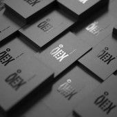
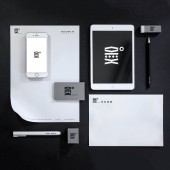
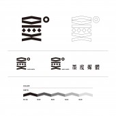
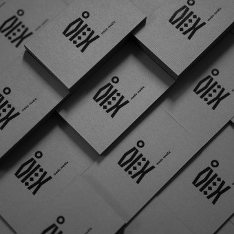
| DESIGN NAME: MADO Media Image Design PRIMARY FUNCTION: Corporate Design INSPIRATION: Since the business name "MADO" pronunciation and Cantonese pronunciation "mak" "dok" same, "mak" character is "墨", "dok" character is the "度", so the Chinese character "墨"(ink) and "度"(degr UNIQUE PROPERTIES / PROJECT DESCRIPTION: MADO is a newly established media company founded by two young men, they want to express the company's logo in Chinese characters, but they want to use an original character design, so the birth of this design. Marking requirements simple, prominent, can simply be used on different media.We hope to use the mark on Chinese characters, but also to join the modern design elements in the font. OPERATION / FLOW / INTERACTION: Design a new Chinese character "墨"(ink) logo and image design. PROJECT DURATION AND LOCATION: The project started in January 2014 in Macao and finished in March 2014. |
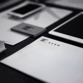
PRODUCTION / REALIZATION TECHNOLOGY: Black and white color is more able to cope with signs used in different category SPECIFICATIONS / TECHNICAL PROPERTIES: namecard : 9cm X 5.4cm letter paper : 21cm X 29.7cm envelope : 21cm X 14.85cm TAGS: media,ink,black,whit RESEARCH ABSTRACT: - CHALLENGE: The most difficult is how a new design has a long history of Chinese characters, in addition to see the Chinese characters outside, but also to let people know that something new is a redesigned, revised repeatedly after repeated optimization, obtained the final version, is the most satisfactory. ADDED DATE: 2016-01-15 04:38:15 TEAM MEMBERS (5) : Designer:Lam Kam Kun, Photography:Lam Kam Kun, Photography assistant:Fran Tong, and IMAGE CREDITS: Lam Kam Kun, 2015. |
||||
| Visit the following page to learn more: https://www.behance.net/gallery/33832566 |
|||||
| AWARD DETAILS | |
 |
Mado Media Image Design Corporate Design by Lam Kam Kun is Winner in Graphics, Illustration and Visual Communication Design Category, 2015 - 2016.· Press Members: Login or Register to request an exclusive interview with Lam Kam Kun. · Click here to register inorder to view the profile and other works by Lam Kam Kun. |
| SOCIAL |
| + Add to Likes / Favorites | Send to My Email | Comment | Testimonials | View Press-Release | Press Kit | Translations |
| COMMENTS | ||||||||
|
||||||||

