Yuen Residence Private Residence by Chiu Chi Ming Danny |
Home > |
 |
|
||||
| DESIGN DETAILS | |||||
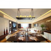
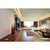
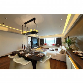
| DESIGN NAME: Yuen Residence PRIMARY FUNCTION: Private Residence INSPIRATION: Hotel-design concept is applied in this project to provide a vacation home idea for the customer. UNIQUE PROPERTIES / PROJECT DESCRIPTION: The project at Providence Bay is contemporary with simple lines and colour contrast. The entire living space is wrapped in white, with wooden dining table and floor which create stunning visual contrasts. The large windows act like transparent gates letting you inhale the city pulse. With the extensive use of white, wood and natural elements, the project is characterized by elegance and tastefulness, which makes you forget you are living in one of the most crowded cities in the world. OPERATION / FLOW / INTERACTION: Designer paid particular attention to the materials and lighting of the entire residence to make it comfortable as possible. PROJECT DURATION AND LOCATION: Project Duration: Feb 2014 ~ Nov 2014 Location: Tai Po, Hong Kong FITS BEST INTO CATEGORY: Interior Space and Exhibition Design |
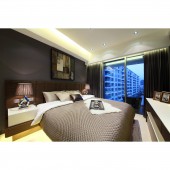
PRODUCTION / REALIZATION TECHNOLOGY: As customer requests spacious design concept, so the original kitchen wall was knocked down and converted into an open kitchen, natural lighting of the kitchen is improved with sunlight. Approximately three meters of windowsill cushions and debris cabinet are set up near the area of the living room, enrich the vocation element for the living area. Moreover, a private workshop is requested by the customer, a multi-purpose room with higher platform is decorated, and provided hidden bed, wardrobe and bookshelf. Cloakroom is also provided in the master bedroom, consistent design of the living room and master bedroom, the design of simplicity romance is fully revealed. SPECIFICATIONS / TECHNICAL PROPERTIES: This flat located at Tai Po Hong Kong with an area 1400 sq.ft. TAGS: Contemporary , Simple, Hotel style RESEARCH ABSTRACT: Hotels with contemporary and simple style around the world. CHALLENGE: This unit is a bit like the outline of a dumbbell, the middle is a narrow corridor, living & dining area and bedrooms are on both sides of the house, see the wall once enter the house, spacing and vision are unsatisfactory. A sense of space has also been achieved by removing the wall between the foyer and the kitchen, open kitchen design, and set trapdoor in the foyer to divide public and private space, greatly improved the previous shortcomings. ADDED DATE: 2015-12-19 05:23:42 TEAM MEMBERS (1) : Design Director: Chiu Chi Ming Danny IMAGE CREDITS: Image #1: Photographer Chow Chi Hung, Chiu Chi Ming Danny, 2014. Image #2: Photographer Chow Chi Hung, Chiu Chi Ming Danny, 2014. Image #3: Photographer Chow Chi Hung, Chiu Chi Ming Danny, 2014. Image #4: Photographer Chow Chi Hung, Chiu Chi Ming Danny, 2014. Image #5: Photographer Chow Chi Hung, Chiu Chi Ming Danny, 2014. PATENTS/COPYRIGHTS: Patents: Danny Chiu Interior Designs Limited |
||||
| Visit the following page to learn more: http://www.dannychiu.com.hk | |||||
| AWARD DETAILS | |
 |
Yuen Residence Private Residence by Chiu Chi Ming Danny is Runner-up for A' Design Award in Interior Space and Exhibition Design Category, 2015 - 2016.· Press Members: Login or Register to request an exclusive interview with Chiu Chi Ming Danny. · Click here to register inorder to view the profile and other works by Chiu Chi Ming Danny. |
| SOCIAL |
| + Add to Likes / Favorites | Send to My Email | Comment | Testimonials |


