DESIGN NAME:
Adria Experience
PRIMARY FUNCTION:
Visual Identity
INSPIRATION:
Adria Experience offers sailing on the Adriatic coast so the idea was to give people a teaser - small window - to great experience, and make it personal.
UNIQUE PROPERTIES / PROJECT DESCRIPTION:
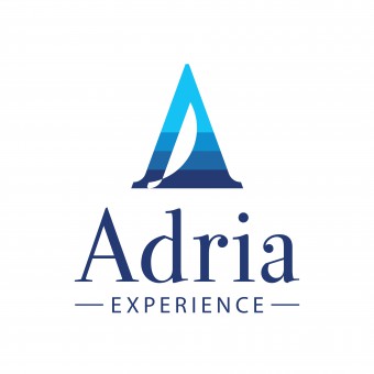
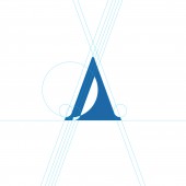
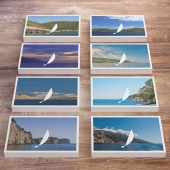
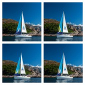
Adria Experiance is small, Croatian agency for nautical tourism with personal touch. The idea was to use logo mark as a window to sailing experiences that Adriatic sea can offer.
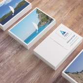
Business cards look like postcards to remind viewer of vacation. The cards have different backs so people can choose the one they like most. It gives the client a chance to testify they have personal approach to their guests and show the diversity and richness of Adriatic coast.
OPERATION / FLOW / INTERACTION:
Unlike postcards that usualy show well known townscapes, the photos on business cards are shot from sailing boat, showing rarely visited pearls of coast, which makes cards authentic. On front of cards there is also a space for short message as a personal touch. It is not just a card with contact info, it is an invitation, reminder, or a souvenir that rewokes great memories.
PROJECT DURATION AND LOCATION:
The project started in November 2014 and finished in January 2015.
FITS BEST INTO CATEGORY:
Graphics, Illustration and Visual Communication Design
|
PRODUCTION / REALIZATION TECHNOLOGY:
Business cards are MOO Luxe cards, printed on Mohawk Superfine 600 gsm paper. Cards are printed with eight (8) different pictures on the back.
SPECIFICATIONS / TECHNICAL PROPERTIES:
Business cards dimensions: 85 x 55 cm
TAGS:
logo, identity, graphic, brand, business, card, tourism, sailing, sea, creative
RESEARCH ABSTRACT:
-
CHALLENGE:
Client wanted professional / serious look with personal touch. The challenge was to avoid usual coldness of "serious looking" identities, and make connection with audience.
ADDED DATE:
2015-12-15 20:41:00
TEAM MEMBERS (1) :
IMAGE CREDITS:
Photos on business cards by studio Stojcic i Romulic.
|

