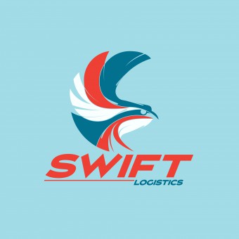
Swift Logistics Animation by Ben & Anvil |
Home > Winners > #43543 |
 |
|
||||
| DESIGN DETAILS | |||||
| DESIGN NAME: Swift Logistics PRIMARY FUNCTION: Animation INSPIRATION: Our inspiration was the modernist use of a limited palette. It makes for a cohesive project and some innovative uses of colour. We kept to bright colours that were different to the colours of the actual items in reality. This helped to carry the idea that the images were symbols or icons, rather than graphical representations. This was to ensure that the logo did not look like a separate element to the animation, tacked on to the end as an afterthought. The palette ensured a running theme. UNIQUE PROPERTIES / PROJECT DESCRIPTION: The brief for this project was to create a short animation for Swift Logistics company. The animation shows some of the different modes of transport and shipping that a logistics company would use. We see our package, which goes into a van, then onto an airplane and then is delivered to a house. The palette is limited to four bright colours, and these coloured shapes transform into each new image. These four colours then make up the company logo for the last scene. OPERATION / FLOW / INTERACTION: The animation opens on a blue backdrop. Six circles appear on the screen and spin down to transform into a box for delivery. The box closes and is sealed. The box transforms back into the circles which spin down to make a van. We see a couple of boxes in the back of the van bouncing around. The van transforms into an airplane which sways from side to side as if flying. This turns into a door which opens to reveal the package on the doorstep. This then transforms into the shipping company's logo. PROJECT DURATION AND LOCATION: The project started in May 2015 and took one week to complete. FITS BEST INTO CATEGORY: Graphics, Illustration and Visual Communication Design |
PRODUCTION / REALIZATION TECHNOLOGY: This was designed and completed using the Adobe Creative Suite, first in Illustrator and Photoshop, then composited in After Effects. The element of movement was important, to keep the symbols from looking static. This was to ensure that the viewer would continue to be interested, so we have a bounce or sway added to each element. It was essential to use an audio track that was upbeat and light, to help create a sense of fun. SPECIFICATIONS / TECHNICAL PROPERTIES: This was rendered in cinematic 16:9 aspect ratio. TAGS: Animation, Motion Graphics, Visual Communications, Logo, Sting, Ident RESEARCH ABSTRACT: The most important aspect of this animation was to transmit the idea of a variety of shipping methods all working together to deliver a package. We wanted to show that each method was distinct but that it was one journey. The use of a limited palette and transforming one image into the next helped to carry the idea. Creating it with simple vector shapes that had similar styles in their angles and simplicity of design meant it was a very graphical look, with an illustrative quality. CHALLENGE: The hardest part of this design challenge was creating images that were equally similar in detail, so they looked like part of a set. Also we had to be creative in the placement of colour so that each element had equal proportions of the colours used, to further give the idea of a set. Then choosing how to break up each image and transform it into the next was difficult to keep it looking fresh. We started with a logo design and palette that worked, and moved from there to designing the others. ADDED DATE: 2015-10-25 16:51:09 TEAM MEMBERS (2) : Daniel Cantwell and Ailbhe Cantwell IMAGE CREDITS: Image #1: Creator Daniel Cantwell, 2015 Image #2: Creator Daniel Cantwell, 2015 Image #3: Creator Daniel Cantwell, 2015 Image #4: Creator Daniel Cantwell, 2015 Image #5: Creator Daniel Cantwell, 2015 Video Credits: Creator Daniel Cantwell, 2015 |
||||
| Visit the following page to learn more: http://bit.ly/1NutwWN | |||||
| AWARD DETAILS | |
 |
Swift Logistics Animation by Ben & Anvil is Winner in Graphics, Illustration and Visual Communication Design Category, 2015 - 2016.· Read the interview with designer Ben & Anvil for design Swift Logistics here.· Press Members: Login or Register to request an exclusive interview with Ben & Anvil. · Click here to register inorder to view the profile and other works by Ben & Anvil. |
| SOCIAL |
| + Add to Likes / Favorites | Send to My Email | Comment | Testimonials | View Press-Release | Press Kit |
Did you like Ben & Anvil's Graphic Design?
You will most likely enjoy other award winning graphic design as well.
Click here to view more Award Winning Graphic Design.


