Movement Palace Cinemas by OFT Interiors Ltd. |
Home > Winners > #43200 |
 |
|
||||
| DESIGN DETAILS | |||||
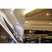
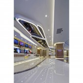
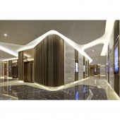
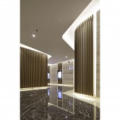
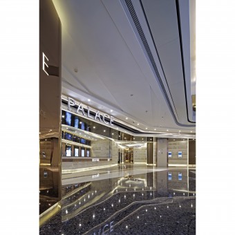
| DESIGN NAME: Movement PRIMARY FUNCTION: Palace Cinemas INSPIRATION: Nowadays artworks, such as pictures, motion pictures and music, cannot be simply categorised into genres like abstract art, neo classical and pop art, which is due to the mix practice of creation themes as well as mixed media, in order to express richer and more complicated contents than those ever presented. Based on the same norm, which consists of the complex theme of contemporary and nature styles that demonstrates designer’s cognition and pursuit of splendour. UNIQUE PROPERTIES / PROJECT DESCRIPTION: The geometrical concept, which is a mixture of modern and nature styles, is emphasized by the false ceiling with light trough and the monochrome marble floor finish. In addition of the even bigger set of high gloss paint finished metal strips feature wall and marble finishes, as well as the gigantic stainless steel theatre numbers signage with black mirror finish, the maximization is finally completed just before visitors enter the theatres. OPERATION / FLOW / INTERACTION: The ticket box counter and the VIP concierge counter are welcoming visitors into the corridor to theatres while they escort people into there from the both sides of corridor entrance. The corridors inherited the setting of the lobby outside, irregular forms and shapes are still dominating in this area. The geometrical concept, which is a mixture of modern and nature styles, is emphasized by the false ceiling with light trough and the monochrome marble floor finish. In addition of the even bigger set of high gloss paint finished metal strips feature wall and marble finishes, as well as the gigantic stainless steel theatre numbers signage with black mirror finish, the maximization is finally completed just before visitors enter the theatres. PROJECT DURATION AND LOCATION: The project started in April 2014 in Chongqing and finished in August 2015, and was opened in August 2015. FITS BEST INTO CATEGORY: Interior Space and Exhibition Design |
PRODUCTION / REALIZATION TECHNOLOGY: - SPECIFICATIONS / TECHNICAL PROPERTIES: 2500 sqm TAGS: cinema, interiors design, entertainment space RESEARCH ABSTRACT: To bring out the theme, the large stainless steel logo signage hanged from ceiling and glittering down there, whereas a row of bamboo-like down lights are working behind it as a backdrop as they spread from above of ticket box counter to the where the ticket machines are. The massive set of decoration appears like the Bilbao Guggenheim Museum has been built inside a bamboo forest, this is how the design concept being exhibited in an observable manner. The spatial planning of the lobby space is unintentionally unsystematic, which is similar to Frank Gehry’s contemporary style with a stroke of abstract art. The brownish marble finish with natural web pattern on all over the walls and counters in the interior are the media that perform the style of Gehry, with the contemporary form that is enriched by the natural pattern. Two rows of stainless steel wall hung fixture with rosary gold mirror finish have surrounded the interior with the bamboo down lights and marble wall finishes, along with various fittings such as skirting, ATMs, LCD monitors and poster light boxes, all perfectly fitted on the stainless steel features. Repetitive and industrial form of the stainless steel features crushed with the shimmering material on them, then here comes the palette of contemporary style and natural style in this space. As well, the three kinds of marble floor finishes with different colour tones have developed into an abstract style portrait with their geometric shapes, which fulfilled a vision of three dimensional art by the match up with the lobby setting. CHALLENGE: This kind of gorgeousness with messages has been established here by the freestanding basins with distinctive appearance, the groove ornaments right above them has proven the existence of the gorgeousness. Atop of the design features mentioned above, there is another even more eye-catching feature, which is the rosary gold finished stainless steel trimmings with light troughs next to cubicle doors, condensed splendor of nature with a twist of shimmering contemporary sensation are the words to describe this feature. On the other hand, the mirrors offer the same atmosphere too. As long as it is the place for the relief of visitors, so just take the “sparkling little creek” ceiling feature as the very last subject feature of this project’s design theme. ADDED DATE: 2015-09-30 04:42:03 TEAM MEMBERS (2) : CM JAO and KEN CHEUNG IMAGE CREDITS: Hu Wenkit / Oft Interiors Ltd. PATENTS/COPYRIGHTS: Copyrights belong to Oft Interiors Ltd., 2016. |
||||
| Visit the following page to learn more: https://www.facebook.com/oft.interiors | |||||
| AWARD DETAILS | |
 |
Movement Palace Cinemas by Oft Interiors Ltd is Winner in Interior Space and Exhibition Design Category, 2015 - 2016.· Press Members: Login or Register to request an exclusive interview with OFT Interiors Ltd.. · Click here to register inorder to view the profile and other works by OFT Interiors Ltd.. |
| SOCIAL |
| + Add to Likes / Favorites | Send to My Email | Comment | Testimonials | View Press-Release | Press Kit |

