DESIGN NAME:
A&P Branding
PRIMARY FUNCTION:
Corporate Identity
INSPIRATION:
The logo used a heavy font type illustrating the architecture, while the ampersand was used as a representation of a balancing beam that also broke the monotony of the architecture.
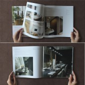
The brochure followed the values of the firm, by keeping the layout clean with the use of white spaces and a simple grid.
UNIQUE PROPERTIES / PROJECT DESCRIPTION:
A&Partners are a architecture firm based in Indonesia. The team is lead by Alvin Jo. His style is very minimalistic and clean. The end result is almost always dramatically uplifted with use of textures and architectural lines. This project was to create a logo and brochure that upheld the same style values.
OPERATION / FLOW / INTERACTION:
The logo and branding were use on corporate identities like namecard and letterhead. The brochure is given out to members of public.
PROJECT DURATION AND LOCATION:
The project started in 2013 and finished in 2015.
FITS BEST INTO CATEGORY:
Graphics, Illustration and Visual Communication Design
|
PRODUCTION / REALIZATION TECHNOLOGY:
The logo design was started by studying architectural and interior structure. Development and idea of the logos were sketch on paper and eventually, fine tune to the finalise artwork.
The brochure design starts with the planning of space and layout of the images.
SPECIFICATIONS / TECHNICAL PROPERTIES:
420mm x 210mm, opened
210mm x 210mm, closed
TAGS:
interior, architecture, design, logo, brochure
RESEARCH ABSTRACT:
Research begins with looking at asymmetrical architecture building. The philosophy of the company is to use basic elements and material to create some extraordinary yet retaining a balance of calm.
CHALLENGE:
The challenge is to make sure the logo retains the basic of the letter A & P yet transforming them into to representative of a architecture building.
To attract attention of the the reader while looking at the brochure, the size and quality of the image is crucial. One of the challenge is set to how to balance the space and not making the page look over crowded.
ADDED DATE:
2015-09-30 04:27:43
TEAM MEMBERS (2) :
Logo Designer: Yvonne Kui and Brochure Designer: Maitri Marks
IMAGE CREDITS:
Photographer: Yvonne Kui & Maitri Marks
|


