DESIGN NAME: Pontofrio Premium
PRIMARY FUNCTION: Flagship Retail Store
INSPIRATION: The digital dialog must start today for the brand and the staff to build a relationship with its clients. Internet of everything is here and spreading quite fast. Customers power of decision requires an store where they can feel at home or in any place they might be during their daily activities.
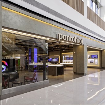
UNIQUE PROPERTIES / PROJECT DESCRIPTION: Use of the space created the right proportion for a retail experience. The balanced use of material and colors create the right ambience for customers to experiment and shop for the newest technology. There are 3 areas with different sound tracks and everyday usage of product sold in these areas. There are 3 different aromas to enhance each area. Customers sit in Designers chair as they are served by the staff including for payments.
OPERATION / FLOW / INTERACTION: The store needs a trained staff and the support of buyers, marketing and logistics to create the right experience for the customers.
PROJECT DURATION AND LOCATION: The project started in Sao Paulo Brasil in June of 2013 and was completed on April 28th of 2015. Two stores were opened at the same time, one in Sao Paulo and the other in Rio de Janeiro.
FITS BEST INTO CATEGORY: Interior Space and Exhibition Design
|
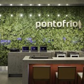
PRODUCTION / REALIZATION TECHNOLOGY: Decisions were made based on the customers' lifestyle and what they understand as the architectural elements of today. The correct balance of ceramic, wood, metals, concrete and lighting brings together the solution for this space. A dehydrated vertical garden was introduced to bring nature and put a human touch in the store.
SPECIFICATIONS / TECHNICAL PROPERTIES: 275 square meters with up to 3,00 meters ceilings. 6 meters entrance and a mezzanine for stockroom. Ductworks for AC, LED lighting,
TAGS: Store, retail, flagship, electronics, appliances, mobile, digital, signage, luxury, service
RESEARCH ABSTRACT: Research was done on market and customer profiles, trends and growth.
Position of the company and where it wants to go, repositioning of the brand to reach other markets, product mix and services for the targeted market and the architectural language to be part of a evolving retail space.
CHALLENGE: The creative chalange was to identify the right ambieance that can speak to the targeted market qne allows the comapny to expand sustainably. Also to introduce a new coulture to a company that is entering a new market position and requires an upgrade to service it.
ADDED DATE: 2015-09-29 22:54:12
TEAM MEMBERS (5) : Antonio Mingrone, Lighting Design, Renata Petracco Barra, Creative Director, Mauricio Mimoto, Lead architect, André Gavioli, project manager and
IMAGE CREDITS: Carlos Piratininga, photographer
|