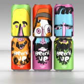
Beer'd Up Beer packaging by Springetts Brand Design Consultants |
Home > Winners > #43124 |
 |
|
||||
| DESIGN DETAILS | |||||
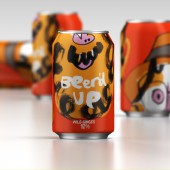
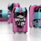
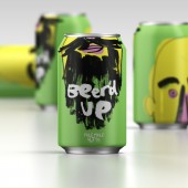
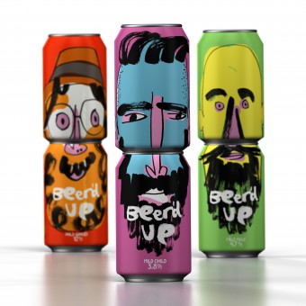
| DESIGN NAME: Beer'd Up PRIMARY FUNCTION: Beer packaging INSPIRATION: The main can illustrations were created by Jon Burgerman, a New York based artist, instigating improvisation and play through drawing and his unique doodle art style. His work is lies between fine art, urban art and pop-culture, it uses humour to reference and question his contemporary environment. Jon’s style created a fresh take on hipster culture and created a vibrant explosion of ‘wearable can beards’. UNIQUE PROPERTIES / PROJECT DESCRIPTION: This is a concept for a craft artisan beer building on the trend of ale drinkers versus lager drinkgers. The idea draws together the trends of craft beers and young hipsters who are bearding up and beardless people who wanted to feel part of the trend. The can illustration creates humour around beards and contemporary culture. The back of pack faces create hipster totem poles and a wall of Beer'd Up characters on shelf. OPERATION / FLOW / INTERACTION: The back of pack was designed with the top of each face, which allows people to create their own hipster 'totem poles' and creates a wall of ‘Beer’d up’ characters on-shelf. PROJECT DURATION AND LOCATION: Project was started and completed in 2015, London, United Kingdom FITS BEST INTO CATEGORY: Packaging Design |
PRODUCTION / REALIZATION TECHNOLOGY: Design concept for craft beer packaging SPECIFICATIONS / TECHNICAL PROPERTIES: Stock metal beer can TAGS: Concept, packaging, beer, can, hipster, beard RESEARCH ABSTRACT: - CHALLENGE: Creating an exciting, modern concept that would appeal to a hard-to-please audience contemporary audience. ADDED DATE: 2015-09-29 13:39:50 TEAM MEMBERS (3) : Creative Director: Paul Williams, Illustrator: Jon Burgerman and Illustrator: Stuart Witter IMAGE CREDITS: Illustrator: Jon Burgerman |
||||
| Visit the following page to learn more: http://www.springetts.co.uk | |||||
| AWARD DETAILS | |
 |
Beer'd Up Beer Packaging by Springetts Brand Design Consultants is Winner in Packaging Design Category, 2015 - 2016.· Read the interview with designer Springetts Brand Design Consultants for design Beer'd Up here.· Press Members: Login or Register to request an exclusive interview with Springetts Brand Design Consultants. · Click here to register inorder to view the profile and other works by Springetts Brand Design Consultants. |
| SOCIAL |
| + Add to Likes / Favorites | Send to My Email | Comment | Testimonials | View Press-Release | Press Kit |
Did you like Springetts Brand Design Consultants' Packaging Design?
You will most likely enjoy other award winning packaging design as well.
Click here to view more Award Winning Packaging Design.


