The North Face Westfiled Bondi Junction Retail Store by CoMa - Interior Architecture Studio |
Home > Winners > #42789 |
 |
|
||||
| DESIGN DETAILS | |||||
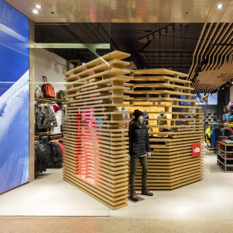
| DESIGN NAME: The North Face Westfiled Bondi Junction PRIMARY FUNCTION: Retail Store INSPIRATION: The inspiration for the main feature for the store - cube - came from brand’s square logo, taking it as a point of departure and making it into a three-dimensional element. Through the use of plywood sheets and inspired by parametric architecture, the cube was dematerialised allowing visual connections between the outside and inside of the store. The dematerialisation of the cube responded to the mountain landscapes that are intrinsic to this brand. UNIQUE PROPERTIES / PROJECT DESCRIPTION: Situated in a shopping centre, the primary design focus was a good articulation of the shopfront to make it stand out. The customer would rarely approach the store front on therefore lateral views needed to be considered. An oversized plywood cube at 45 angle at the front of the store responds this design dilemma. This element creates a feature and backdrop for the window and offers the housing for the sales desk area. Utilising timber battens as a ceiling feature draws the customer’s eyes to the inside of the store while creating a dialogue with the shopfront cube OPERATION / FLOW / INTERACTION: The design creates a dialogue between the outside and inside of the store. The intention by locating the cube at 45 degree angle and having it see through, was to invite people to discover and explore what is behind it. Once inside the store, the flow is clean and easy to navigate. The customer can pick up their choices along the way before getting to the back of the store, where the more static part of is located. The fitting room’s volume alongside the shoe wall and seating area provides a more relaxed and contained feeling for the customer. PROJECT DURATION AND LOCATION: The Project is located in Westfield Bondi Junction in Sydney, Australia. Design Phase started in February 2015. Construction from June 2015. Completion July 2015. FITS BEST INTO CATEGORY: Interior Space and Exhibition Design |
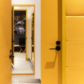
PRODUCTION / REALIZATION TECHNOLOGY: The finishes palette is clean and quite minimal, concrete finishes to the shopfront and floor throughout the store, white walls, yellow fabric and timber features. The use of dark charcoal ceiling finish gives a nice contrast to all these elements. Natural materials such as timber and black slate tiles combined with man-made materials like concrete and metal play with the essence of the brand which sells highly technical products produced for man to interact with nature. The custom printed fabric and the location of the volume for the fitting room pays homage to the sleeping bags and tents. SPECIFICATIONS / TECHNICAL PROPERTIES: The total store area is 180sqm, divided in 147sqm of retail space and 33sqm of store room. The shopfront is only 8.2m wide, making the space quite long and narrow. Keeping the shopfront visually open was important to draw the customer into the store. This was achieved by using frameless glass, the deconstructed plywood cube at 45 degree angle and the ceiling feature. TAGS: Interiors, design, retail, retaildesign, cube, plywood, interiorarchitecture RESEARCH ABSTRACT: The design research was based on taking the square logo, transforming it into an abstract 3D cube and dematerialising it to allude to the logo form without being too literal, and at the same time having a function. Making models of the cube was crucial in the research phase to really understand the proportions between mass and void, how thick the ribs should be and the space between them, how much of the volume should disappear or stay. The client and joiner took part of the research, as the cube had to be aesthetically right for the space, respond to the function correctly and be able to be built. CHALLENGE: The cube itself was the major challenge, plywood as the material proved to be the right one; however it still presented some technical challenges. The length and thickness of the standard sheets were not right. It was important for the design integrity for each rib of the cube to have one sheet of plywood without any joints and the proportions of mass and void to be maintained. The solution was to join 2 sheets together to achieve the correct thickness and custom-made length. All dimensions and proportions were adjusted and the end product looks like it was always supposed to be that way. ADDED DATE: 2015-09-24 05:41:48 TEAM MEMBERS (4) : Design Director: Mariela Sverdloff, Design Associate: Azul Paklaian, Senior Design Associate: Sebastian Seoane-Velilla and IMAGE CREDITS: Image #1: Photographer Tom Ferguson, TNF Westfield Bondi Junction, 2015 Image #2: Photographer Tom Ferguson, TNF Westfield Bondi Junction, 2015 Image #3: Photographer Tom Ferguson, TNF Westfield Bondi Junction, 2015 Image #4: Photographer Tom Ferguson, TNF Westfield Bondi Junction, 2015 Image #5: Photographer Tom Ferguson, TNF Westfield Bondi Junction, 2015 |
||||
| Visit the following page to learn more: http://coma.com.au | |||||
| AWARD DETAILS | |
 |
The North Face Westfiled Bondi Junction Retail Store by Coma-Interior Architecture Studio is Winner in Interior Space and Exhibition Design Category, 2015 - 2016.· Press Members: Login or Register to request an exclusive interview with CoMa - Interior Architecture Studio. · Click here to register inorder to view the profile and other works by CoMa - Interior Architecture Studio. |
| SOCIAL |
| + Add to Likes / Favorites | Send to My Email | Comment | Testimonials | View Press-Release | Press Kit |


