Huiqi Office Interior Space Design by Wenzhi Space |
Home > Winners > #42745 |
 |
|
||||
| DESIGN DETAILS | |||||
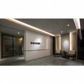
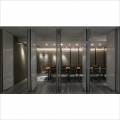
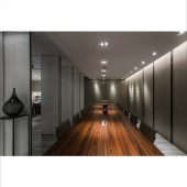
| DESIGN NAME: Huiqi Office PRIMARY FUNCTION: Interior Space Design INSPIRATION: The space of this office is not big. What we consider is how to make the space more bigger by design. We try to make people lost in space and details by that the space is divided into some sections then limits are dimmed. At the same time, contact of each section and penetrability of vision is reinforced. We find the space control way much in little from space control of Chinese landscape and get inspiration from Scarpa details and joints. UNIQUE PROPERTIES / PROJECT DESCRIPTION: The area of this office is not big. The manager's office is close to entrance and the meeting room is in the innermost of the space. This structure is built based on Chinese geomancy. How to make space larger in such situation? Making bigger space need to be guided by smaller measure. In the meantime, disassembling the whole, stressing the details on design by happening of potential, which can guide action and construct space level. People can get brand new feel by all kinds of perception. OPERATION / FLOW / INTERACTION: 1. Using the technique of manual wooden veneer without ending line which makes wall modeling forming slight thickness for 20mm. In this way, the design keeps visual integrality and conciseness. 2. All different material with color assortment of the same color system enhance space depth in visual sense. 3. Different collocations of matt finish and glaze or real and virtual material avoid narrow for small space. PROJECT DURATION AND LOCATION: Project duration: 3 months Location: Jin Cheng Mansion, Dongfen east road, Guangzhou FITS BEST INTO CATEGORY: Interior Space and Exhibition Design |
PRODUCTION / REALIZATION TECHNOLOGY: Materials: stoving varnish board, veneer, floor tile, volakas white marble, cloth SPECIFICATIONS / TECHNICAL PROPERTIES: 19520mm * 10500mm * 3200mm TAGS: office, space design, geomancy, modern, Chinese style RESEARCH ABSTRACT: We use the technique of Suzhou garden in the face of such small space. What we can do is to enrich the content of it when the space is small. There is no theme for office usually. However, we defined the theme as in inch as in mile at the very beginning. It means we hope users could feel roomy and comfortable in this small space through design. CHALLENGE: The key during design process is how to make layer modeling blend in the space and how to master contrast intensity between color and texture. Concave-convex modeling is guided by light, stop or move, wait and see or communication. All these must be elaborate. The design of meeting room’s door and ceiling’s combining together which make layer of space dividing into three parts. Meantime, black line of door is in concert with black stainless steel line in meeting room. ADDED DATE: 2015-09-23 06:21:30 TEAM MEMBERS (7) : Wenzhi Liu, Liangcai Chan, Qijian Wong, Jianfang Leung, Jianhao Du, Weijian Lu and Jiacheng Ho IMAGE CREDITS: Image #1, Image #2, Image #3, Image #4, Image #5: Photographer Ken Wong, 2015 |
||||
| Visit the following page to learn more: http://www.cool-de.com/thread-1136448-1- |
|||||
| CLIENT/STUDIO/BRAND DETAILS | |
 |
NAME: Wenzhi Space PROFILE: - |
| AWARD DETAILS | |
 |
Huiqi Office Interior Space Design by Wenzhi Space is Winner in Interior Space and Exhibition Design Category, 2015 - 2016.· Press Members: Login or Register to request an exclusive interview with Wenzhi Space. · Click here to register inorder to view the profile and other works by Wenzhi Space. |
| SOCIAL |
| + Add to Likes / Favorites | Send to My Email | Comment | Testimonials | View Press-Release | Press Kit |


