eating table restaurant Interior Space Design by Wenzhi Liu |
Home > Winners > #42662 |
 |
|
||||
| DESIGN DETAILS | |||||
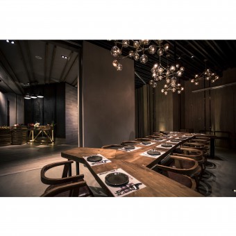
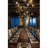
| DESIGN NAME: eating table restaurant PRIMARY FUNCTION: Interior Space Design INSPIRATION: This restaurant is located in in Guangzhou. Guangzhou is not only the biggest city in the south of China, but also the Top three cities in China. Life here is fast-paced and busy. Therefore, I hope to provide a place which can make people spiritual tranquility here. Meanwhile, I try to make this industrial style some different because I hope Chinese traditional aesthetics could be inherited. UNIQUE PROPERTIES / PROJECT DESCRIPTION: This restaurant is located in Pearl River Metro which is one of China's Top Three CBD center. Obviously, it's luxurious to pursue spiritual tranquility in the concrete jungle. Antithesis is used in this design. There are exquisite design for corresponding joint, solidification of light, warm furniture, etc. Perfect combination of all these factors which depends on the interaction of joints and structure between cohesion and dissociation builds a new level of antithesis. OPERATION / FLOW / INTERACTION: Height, size as well as direction of each lights in ceiling is different, some are bright and some are dark. They seems be disordered. However, it forms strong comparison with orderly wine cabinet on the wall. Square tubes are used in modeling of wall frame, combining wine cabinet, that not only makes enclosed space but also weaken the huge pillar effectively. PROJECT DURATION AND LOCATION: Project duration: 50 days Location: Winter Square of Gtland Plaza in Pearl River Metro FITS BEST INTO CATEGORY: Interior Space and Exhibition Design |
PRODUCTION / REALIZATION TECHNOLOGY: Materials: cement, iron, wood floor, beech SPECIFICATIONS / TECHNICAL PROPERTIES: 40965mm * 31935mm * 3400mm(Max)/2800mm(M TAGS: restaurant design, industrial style, rough, cement, iron RESEARCH ABSTRACT: We design by using technique of Western Modernism as foundation and combining space process mode of classical Chinese garden. We study Mr. Scarpa’s technique to control the node. Usually, western restaurant is designed base on 1.5sqm per person but we design it for 1.8sqm per person for the consideration of comfort level. At the meantime, in order to highlight the reunion concept at table, light is designed to 15 degree and 300K and around is 25 degree. CHALLENGE: In this more than 1,000sqm space, it’s easy to become disordered scene as a restaurant that all tables and chairs are arranged pell mell. Therefore, the key point is to divide the space into different parts effectively as well as make visual sense penetrable. In addition, pillar is particularly obtrusive. However, semi-open box not only weakens the effect of pillar availably but also makes the space compact by enclosure. ADDED DATE: 2015-09-20 03:46:53 TEAM MEMBERS (9) : Wenzhi Liu, Yikang Yang, Liangcai Chan, Qijian Wong, Jianfang Liang, Jianhao Du, Li an Chen, Weijian Lu and Jiacheng Ho IMAGE CREDITS: Image #1, Image #2, Image #3, Image #4, Image #5: Photographer Jia Hu & Ken Wong, 2015 |
||||
| Visit the following page to learn more: http://suo.im/vqyiu | |||||
| CLIENT/STUDIO/BRAND DETAILS | |
 |
NAME: Wenzhi Space PROFILE: - |
| AWARD DETAILS | |
 |
Eating Table Restaurant Interior Space Design by Wenzhi Liu is Winner in Interior Space and Exhibition Design Category, 2015 - 2016.· Read the interview with designer Wenzhi Liu for design eating table restaurant here.· Press Members: Login or Register to request an exclusive interview with Wenzhi Liu. · Click here to register inorder to view the profile and other works by Wenzhi Liu. |
| SOCIAL |
| + Add to Likes / Favorites | Send to My Email | Comment | Testimonials | View Press-Release | Press Kit |
Did you like Wenzhi Liu's Interior Design?
You will most likely enjoy other award winning interior design as well.
Click here to view more Award Winning Interior Design.


