Beijing Hotpot Logo by Dongdao Team |
Home > Winners > #42377 |
 |
|
||||
| DESIGN DETAILS | |||||
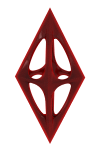
| DESIGN NAME: Beijing Hotpot PRIMARY FUNCTION: Logo INSPIRATION: The inspiration came from the daily life of Beijing residents, who are representatives of traditional culture of the city. We found the unique characteristics and elements in the life of people in Beijing and incorporate these elements into the brand image. UNIQUE PROPERTIES / PROJECT DESCRIPTION: Beijing Hotpot, with a history of more than 1,000 years, is a acclaimed Beijing style hotpot brand. The intention was to create a brand image which stresses the very core of the Beijing culture. Hotpot brands in the past tried to find traditional culture of Beijing through typical Beijing impressions. We, however, examined what constitutes traditional culture of this city and its people who live here. We illustrated humorous, optimistic and life-loving characteristics of its people and objects, which reflect life in general here. We designed a unique font which stressed the very temperament of this metropolitan, yet traditional, city. And, we combined those patterns, and strong visual perceptions, with the shape of a hotpot. We also enhanced it with Chinese brush drawings to showcase daily life of Beijing people, and the very embodiment of Beijing culture. OPERATION / FLOW / INTERACTION: 1.5 months Shanghai, China PROJECT DURATION AND LOCATION: Shanghai, China FITS BEST INTO CATEGORY: Graphics, Illustration and Visual Communication Design |
PRODUCTION / REALIZATION TECHNOLOGY: We used environmental-friend SPECIFICATIONS / TECHNICAL PROPERTIES: - TAGS: Beijng Hotpot RESEARCH ABSTRACT: - CHALLENGE: How to make Beijing Hotpot stand out among other hotpot brands and build its own culture symbol is the main challenge. ADDED DATE: 2015-08-20 06:47:49 TEAM MEMBERS (1) : IMAGE CREDITS: Dongdao Team, 2015. |
||||


| CLIENT/STUDIO/BRAND DETAILS | |
| NAME: Beijing Hotpot PROFILE: Beijing Hotpot, with a history of more than 1,000 years, is a acclaimed Beijing style hotpot brand. |
|

| AWARD DETAILS | |
 |
Beijing Hotpot Logo by Dongdao Team is Winner in Graphics, Illustration and Visual Communication Design Category, 2015 - 2016.· Read the interview with designer Dongdao Team for design Beijing Hotpot here.· Press Members: Login or Register to request an exclusive interview with Dongdao Team. · Click here to register inorder to view the profile and other works by Dongdao Team. |
| SOCIAL |
| + Add to Likes / Favorites | Send to My Email | Comment | Testimonials | View Press-Release | Press Kit |
Did you like Dongdao Team's Graphic Design?
You will most likely enjoy other award winning graphic design as well.
Click here to view more Award Winning Graphic Design.
