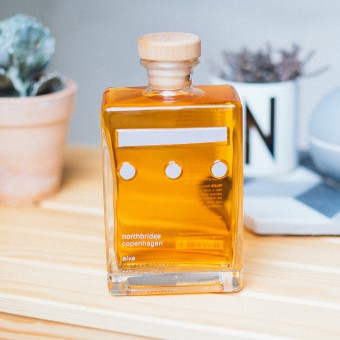
Northbridge Whisky Bottle by Amanda-Li Kollberg |
Home > Winners > #42124 |
 |
|
||||
| DESIGN DETAILS | |||||
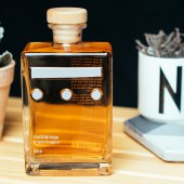
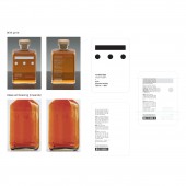
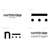
| DESIGN NAME: Northbridge PRIMARY FUNCTION: Whisky Bottle INSPIRATION: In a city who is equal parts refined and aesthatical, and sitting on Dronning Louises Bro, drinking cold beers and cursing, Northbridge finds a place just in the middle. With classic and and down-to-earth connotations combined with a few thought through details, it hopes to be the whisky of Copenhagen. UNIQUE PROPERTIES / PROJECT DESCRIPTION: Northbridge is Scandinavian minimalism fused with North-Copenhagen rough unpretentiousness, to form a frame around a whiskey for the people. The goal is to offer a higher quality than what you would put in your irish coffee, while still not feel like a gift for your uncles 50th birthday. And off course in a more affordable price range. OPERATION / FLOW / INTERACTION: The layout of all the graphics of the bottle, printed or embossed, has a play of symmetry / asymmetry. With a translucent bottle, the placement of the product information is meant to enhance the readability. The mix of screen print and embossing creates two layers interacting with each other. PROJECT DURATION AND LOCATION: The project have developed over Skype during April and May 2015, between the client in Copenhagen, Denmark and the Designer in Berlin, Germany. Only prototypes exist so far as the company is developing the launch strategy for Europe. FITS BEST INTO CATEGORY: Packaging Design |
PRODUCTION / REALIZATION TECHNOLOGY: I have used hand sketching, Adobe Illustrator drawings, and finally had Bruno Everling help do 3D renderings and 3D-print files for prototyping. SPECIFICATIONS / TECHNICAL PROPERTIES: 500 ml glass bottle with wooden cork, embossing and screen printed product information. TAGS: Whisky, Minimalism, Copenhagen, Scandinavia RESEARCH ABSTRACT: Coming into packaging design from a print background, I spent endless amounts of time looking at what was going on in the field, but then quickly moved over to getting a good feeling for the companies visions and inspiration for this product. It was about getting a balance between the rough and the elegant, the refined and the unpretentious, the balance of Copenhagen that the bottle design was supposed to reflect. I wanted a solution that looked very simple but with interesting details, so my research have mainly consisted of sketching and testing, and off curse having some whisky now and then. CHALLENGE: As a yong designer, this is the first packaging project I have been in charge of and developed myself, as well as the first time I have been working with glass and 3D-print prototyping. It has taught me a lot and been a big creative step from my normal print design background. ADDED DATE: 2015-07-12 09:05:21 TEAM MEMBERS (1) : Amanda-Li Kollberg IMAGE CREDITS: Line drawings and Psd-visualisation by Amanda-Li Kollberg / Jetzt PATENTS/COPYRIGHTS: Copyright belongs to Northbridge, Copenhagen, 2015 |
||||
| Visit the following page to learn more: http://www.northbridgewhisky.com | |||||
| AWARD DETAILS | |
 |
Northbridge Whisky Bottle by Amanda-Li Kollberg is Winner in Packaging Design Category, 2015 - 2016.· Read the interview with designer Amanda-Li Kollberg for design Northbridge here.· Press Members: Login or Register to request an exclusive interview with Amanda-Li Kollberg. · Click here to register inorder to view the profile and other works by Amanda-Li Kollberg. |
| SOCIAL |
| + Add to Likes / Favorites | Send to My Email | Comment | Testimonials | View Press-Release | Press Kit |
Did you like Amanda-Li Kollberg's Packaging Design?
You will most likely enjoy other award winning packaging design as well.
Click here to view more Award Winning Packaging Design.


