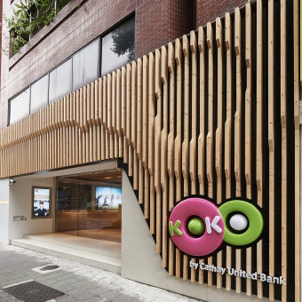
KOKO store Commercial Space by Cheng-Chen Chen |
Home > Winners > #42039 |
 |
|
||||
| DESIGN DETAILS | |||||
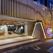
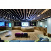
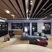
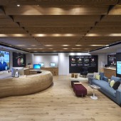
| DESIGN NAME: KOKO store PRIMARY FUNCTION: Commercial Space INSPIRATION: We use a lot of wood factor in this design, the atmosphere of Taiwan's banks in the past is always passive for customers, but KOKO digit bank use the devices which are easier to use for customers. And we replace traditional marble countertops to wood counter, the lower counter for eliminating the distance. Open waiting area with comfortable sofas, customers could experience a very comfortable banking centers, in addition, the projection technology allow the bank's information to run 24 hours . UNIQUE PROPERTIES / PROJECT DESCRIPTION: We are trying to break the existing impression of bank, extending he levels of the space and the elimination of cold color which relates to the atmosphere in a hospital waiting room. We build up an open space to divide each function. Moreover, the magnetic loft style blackboard design added the witty feeling to this calm tone space. The point of this design is making people to feel at home. There are no complex decorations but trying to return to the most comfortable space. OPERATION / FLOW / INTERACTION: 1. Lower the countertop to increase visual penetration 2. Grilled ceiling to widen the vertical height. 3. Black/white wall replaces LED Advertisement Lamp, adding extra lively atmosphere. 4. By outdoor project information on glasses ,people could get information 24/7. PROJECT DURATION AND LOCATION: 2015,in Taiwan |
PRODUCTION / REALIZATION TECHNOLOGY: Each commercial space has its own highlight .This project we place emphasis on arc streamline counter instead of traditional stiffly form .Shaped by purely handmade wooded structure ,time-consuming work SPECIFICATIONS / TECHNICAL PROPERTIES: 95.5 Square meters TAGS: KOKO STORE, BANK, digital materialized concept RESEARCH ABSTRACT: Full text selection of the most natural temperature stable plastic material camp, with special emphasis emotional link objects and daily life. Space, use a lot of wood, proper arrangements in space. Mainly in warm colors, each space presents Japanese style casual style, to convey both close and warm small family feel, the main facility in the living room to follow the rectangular space planning prevail, so that the small floor space showing a very large number, neat and clean, open feel. A combination of simple, pure timber, use of natural light changes the sense of embellishment space, in a large number of blank background,, so that residents in urban life can be disseminated to the holiday relaxing atmosphere, telling the occupants of the bustling city Language , the heart is immersed swim in calm Hermit slow living. CHALLENGE: Think outside of box .KOKO bank ,the first digital materialized concept bank .The goal of KOKO is to satisfy guest and the young generation. People could enjoy and relax as in a hotel lobby. ADDED DATE: 2015-07-02 06:45:59 TEAM MEMBERS (1) : CHENG-CHEN CHEN IMAGE CREDITS: Photographer LIN FU MING PATENTS/COPYRIGHTS: Chen interior design |
||||
| Visit the following page to learn more: http://www.chen-interior.com/commercial. |
|||||
| AWARD DETAILS | |
 |
Koko Store Commercial Space by Cheng-Chen Chen is Winner in Interior Space and Exhibition Design Category, 2015 - 2016.· Press Members: Login or Register to request an exclusive interview with Cheng-Chen Chen. · Click here to register inorder to view the profile and other works by Cheng-Chen Chen. |
| SOCIAL |
| + Add to Likes / Favorites | Send to My Email | Comment | Testimonials | View Press-Release | Press Kit |

