Twin Lotus Herbaliste Eco-friendly Pack Dental Floss Packaging by Prompong Hakk |
Home > Winners > #41890 |
 |
|
||||
| DESIGN DETAILS | |||||
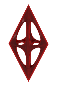
| DESIGN NAME: Twin Lotus Herbaliste Eco-friendly Pack PRIMARY FUNCTION: Dental Floss Packaging INSPIRATION: Originally we were designing a plastic packaging for our client's dental floss when we realized how much waste this segment created and started to rethink our approach. Our idea was to create a packaging that could be reused by refilling the filament. Yet, this only made sense if people were able and willing to keep this box for longer. So we looked at better materials and settled on tin plated steel, the century old choice for candy boxes, perfect for embossing and coloring. UNIQUE PROPERTIES / PROJECT DESCRIPTION: The purpose of the packaging project was to rethink the use and plastic waste of Dental Floss packaging. Our packaging design is made from long lasting tin plated steel which is formed into an icy fresh box that accepts dental floss refills. We placed an augmenting mirror inside the lid for quick check-ups. Our design can be easily carried around during the day and also allows for quick conversation and habitual user interaction. OPERATION / FLOW / INTERACTION: Our Design needed to win the affection of our users if it was to be used and kept for a longer period of time. Ideally we aimed to 'Zippo' our case so that users would interact with the Design as a habit. We aimed at designing a conversation and encouraging natural user interaction. More importantly refilling works effortlessly with the finger lift off design and checking for floss remainder is quick through the built-in gauge, a feature that many floss packaging omit. PROJECT DURATION AND LOCATION: The Design process took us about 3 months from ideation to final data. Designing started roughly around early winter 2014. Manufacturing took another 3 months for complete realization. Product is currently being prepped for launch. |
PRODUCTION / REALIZATION TECHNOLOGY: Tin plated steel is very versatile and flexible to work with, allowing you to emboss all sorts of artwork and color them in various tones. It has an iconic heritage of shear endless box designs. We designed the crystal ice look as a contemporary form inspired by the fresh mint of the dental floss. It was perfectly fitted to the production requirements and yet completely new to the range of samples from our vendor. In our case both top and bottom of the box are drawn out. The ice crystals and box are formed at the same time in one process. SPECIFICATIONS / TECHNICAL PROPERTIES: Width 59,6mm x Length 46,6mm x Height 22mm TAGS: Green Design, FMCG Packaging, Herbaliste, Eco-friendly RESEARCH ABSTRACT: There was no official research inquiry for our project. All insight was gathered by the local Designer pool and the studio members. The waste argument was discovered by in-house brain storming of previous plastic based packaging, a practice we hold in our studio to find possible improvements of conceptual Designs. The winning Design was hand-picked by the client. CHALLENGE: After realizing the waste argument the studio was most worried about getting our client on board. We felt very dedicated to our discovery and saw a real opportunity to bring some change. Fortunately the client saw eye to eye, partially because our approach made sense but mostly because the awareness for green Design in our client’s market was changing for the better. The hardest part of the project was to convince our client to convert to a greener packaging choice and abandon the commercial look for a cleaner, toned down design using recycled paper and single tone soy ink. Finally we arrived at both an eco-friendly case albeit not the green packaging concept. ADDED DATE: 2015-06-29 08:32:32 TEAM MEMBERS (3) : Kamthon Leelertphan, , Prompong Hakk, and Surakead Hemwimon IMAGE CREDITS: Prompong Hakk, 2015. |
||||
| Visit the following page to learn more: https://www.shakesbkk.com | |||||


| CLIENT/STUDIO/BRAND DETAILS | |
 |
NAME: Twin Lotus PROFILE: Herbaliste is a Premium Brand that pioneered professional herbal products in the oral and personal care segment. The Herbaliste brand stands for the best of both worlds, a blend of natural goodness and modern research. We believe in creating products that help people help themselves from inside out and nurture a lifestyle of natural well-being based on traditional Thai elements. Herbaliste is a sub brand of Twin Lotus, Thailand’s most iconic herbal toothpaste sold in Thailand, China, South East Asia, Germany and Russia. |

| AWARD DETAILS | |
 |
Twin Lotus Herbaliste Eco-Friendly Pack Dental Floss Packaging by Prompong Hakk is Winner in Packaging Design Category, 2015 - 2016.· Read the interview with designer Prompong Hakk for design Twin Lotus Herbaliste Eco-friendly Pack here.· Press Members: Login or Register to request an exclusive interview with Prompong Hakk. · Click here to register inorder to view the profile and other works by Prompong Hakk. |
| SOCIAL |
| + Add to Likes / Favorites | Send to My Email | Comment | Testimonials | View Press-Release | Press Kit | Translations |
Did you like Prompong Hakk's Packaging Design?
You will most likely enjoy other award winning packaging design as well.
Click here to view more Award Winning Packaging Design.
