Funny Games Office by Kaixin Lin |
Home > Winners > #41681 |
 |
|
||||
| DESIGN DETAILS | |||||
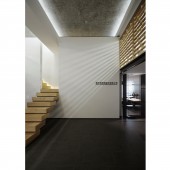
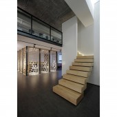
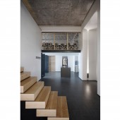
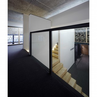
| DESIGN NAME: Funny Games PRIMARY FUNCTION: Office INSPIRATION: In order to create a clean, concise space with affinity, the designer applies traditional white wall and grey tile tone into the space, and matches with the warm wood color. In structure, the blurred division of funny combinations and traditional architecture scale is used, allowing viewers to experience the fun of space game. UNIQUE PROPERTIES / PROJECT DESCRIPTION: There are two white walls in the central foyer and a narrow staircase without handrail is in the middle, which solved the obstruction hindering the movement of people to the attic caused by the roof beams. The staircase separates in the middle to both sides. In the middle of the tall white walls, it is like a gateway leading to elsewhere to attract the visitor of viewers. Through the dim light between the white walls and ceilings, we can see the walls do not really connect with the walls. OPERATION / FLOW / INTERACTION: It makes visitors recall the familiar old times: it is like the "thin strip of sky" in odd stones or the slanting sunlight shadow in ancient alleys, how time flies! This kind of isolated while linked space shows a solemn sense of field to a certain extent, while providing more experience scale to visitors.This kind of vague division is a false impression intentionally made by the designer. However, there is always light at the end of the tunnel, even the unconventional imagination, but life itself should always have surprises, why not? PROJECT DURATION AND LOCATION: The project started in October 2014 and finished in June 2015, and was located in Fuzhou, China. FITS BEST INTO CATEGORY: Interior Space and Exhibition Design |
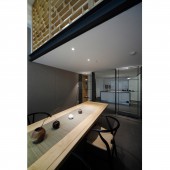
PRODUCTION / REALIZATION TECHNOLOGY: In the ceilinged entrance hall, grey antique bricks are used for the ground, the original white ceiling was shoveled away, exposing the original concrete. The way of sanding made the ceiling achieve the dustproof effect while has special and delicate texture. The customized tea table feet are made of the blocks of find steel, light and modern, creating an illusion of suspension. the office of general manager, because of the small width, the designer used the way of body block cutting. The wood in the left is cut and moved out like a whole piece of wood. Visitors can reach the attic seating area via the start. SPECIFICATIONS / TECHNICAL PROPERTIES: To ensure safety, the lattice grating has enough thickness. When the attic light is on, the light will be mapped on the walls through the thick grid, revealing modern and warm space temperament.In order to ensure unobstructed landscape view, the attic area of tea house does not extend to the junction with the glass, but has a reasonable distance with the glass. Look from the window, you can find another scene in this casual corner. By the wood lattice, you can vaguely see the conference room in the second floor. This kind of vague division is a false impression intentionally made by the designer. TAGS: Office,funny,combina RESEARCH ABSTRACT: The fabric and color relations of traditional architecture. CHALLENGE: To create clean and simple appearance and keep continuity of the space, the staircase in the entrance hall is set without handrail. ADDED DATE: 2015-06-24 02:04:37 TEAM MEMBERS (2) : Design Director:Lin Kaixin and Assistant Designer: Hu Chenyuan IMAGE CREDITS: Image#1—5:Photographer Liu Tengfei |
||||
| Visit the following page to learn more: http://www.dcd-hk.com/ | |||||
| AWARD DETAILS | |
 |
Funny Games Office by Kaixin Lin is Winner in Interior Space and Exhibition Design Category, 2015 - 2016.· Press Members: Login or Register to request an exclusive interview with Kaixin Lin. · Click here to register inorder to view the profile and other works by Kaixin Lin. |
| SOCIAL |
| + Add to Likes / Favorites | Send to My Email | Comment | Testimonials | View Press-Release | Press Kit |

