Life Luxe Day Spa + Laser Retail and Wellness Center by Maria Drugoveiko and Masha Tikhonova |
Home > Winners > #41290 |
 |
|
||||
| DESIGN DETAILS | |||||
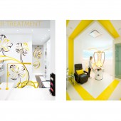
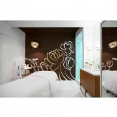
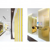
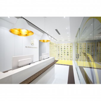
| DESIGN NAME: Life Luxe Day Spa + Laser PRIMARY FUNCTION: Retail and Wellness Center INSPIRATION: Art Nouveau art movement and mid century Modern aesthetic UNIQUE PROPERTIES / PROJECT DESCRIPTION: Can Art Nouveau and Modernism harmoniously co-exist together? They sure can in Vancouver. The clients wanted to create a beautiful organic spa experience with rich colors, curves and textures, a space with European flare. Since the geometry and challenges of the existing space were limiting us from building curvilinear forms inside, we decided to use 2D organic graphics. The inspiration came from Art Nouveau, a distinct but well-forgotten style that captivated Europe at the end of the 19th century. The design inside then became clean and simple. The right balance of different and distinct elements from each style became important. The corporate color palette selected was minimalist white accented by the rich chocolate, gold and yellow used widely in Art Nouveau. We combined saturated brown color with crisp white light, whiplash curves and intricate organic graphics with bold straight lines, gold accents with tubular metal furnishings. While the storefront looks like a bright showroom, the treatment rooms have low light levels for better relaxation and intimacy. Layered ceiling created interest and depth while improving the overall look of mechanical, electrical and other technical functions by hiding or integrating them in a way not visible to clients during treatments. The broad brown line which travels around the salon, wrapping the front entrance wall and ceiling looks bold and minimalist but its idea and color came from Art Nouveau. This simple line made this space looking bold, dynamic and different. High gloss epoxy flooring, custom furniture and European pendant lights added the desired luxe to the space while wisteria inspired golden shimmer beads reflected in full height mirrors defined the waiting area and made it appear more spacious. In addition, each treatment room adopted a flower name instead of just being numbered. Lilies, orchids, jasmine, hibiscus and peonies, all in concept-inspired colors and style, emerged and gave life to these revitalized private spaces. The new storefront glazing not only became a canvas for custom graphics and allowed for unobstructed views, but most importantly it dramatically reduced outside noise which was essential for creating a tranquil spa setting within the space. This salon is open, fully accessible space that attracts and invites people in. OPERATION / FLOW / INTERACTION: Life Luxe Spa became a beautiful, flexible and fully accessible spa salon. The broad brown line which travels around the salon, wrapping the front entrance wall and ceiling, emphasizes the flow and openness in the salon. Every room offers a completely different feel due to custom graphics by GrafikaVision Design. PROJECT DURATION AND LOCATION: The project started in August of 2014 and was completed early November same year. Project location Vancouver, Canada FITS BEST INTO CATEGORY: Interior Space and Exhibition Design |
PRODUCTION / REALIZATION TECHNOLOGY: No VOC high gloss epoxy flooring, custom furniture, Modern polished metal furnishings and European pendant lights. SPECIFICATIONS / TECHNICAL PROPERTIES: Overall space 1500 sq ft It has 5 stylized treatment rooms, a retail area, a waiting area, UD washroom, small office and a prep area. TAGS: Spa, Life, Luxe, Vancouver, Canada, Modern, Art, Nouveau, Lily, Jasmine, Peony, Hibiscus, Orchid, Grafika, Vision RESEARCH ABSTRACT: Major improvements of this space include an electrical upgrade where 80 percent of incandescent lights were switched to LED fixtures. Existing HVAC system has been updated, redesigned and replaced with linear air diffusers, many of which were integrated within the drop ceilings. The new storefront glazing dramatically reduced outside noise which was essential for creating a tranquil spa setting within the space. CHALLENGE: The space needed more than just the removal of a T bar ceiling and a fresh coat of paint. An overhaul of the electrical and mechanical systems, development of a unique brand, and vastly improved space-function and flow were the most important challenges of this project. Inside the Lily room with the slim capsule, we repurposed the existing old screens, by making light fixtures as well as advertisement screens that showcase inspiration words and carried brands in the salon. ADDED DATE: 2015-05-26 00:26:37 TEAM MEMBERS (2) : Interior Designer: Maria Drugoveiko and Graphic Designer: Masha Tikhonova IMAGE CREDITS: All photos by Ema Peter Photography Vancouver, Canada |
||||
| Visit the following page to learn more: http://www.redboxid.com, www.grafikavision.com | |||||
| AWARD DETAILS | |
 |
Life Luxe Day Spa + Laser Retail and Wellness Center by Maria Drugoveiko and Masha Tikhonova is Winner in Interior Space and Exhibition Design Category, 2015 - 2016.· Press Members: Login or Register to request an exclusive interview with Maria Drugoveiko and Masha Tikhonova. · Click here to register inorder to view the profile and other works by Maria Drugoveiko and Masha Tikhonova. |
| SOCIAL |
| + Add to Likes / Favorites | Send to My Email | Comment | Testimonials | View Press-Release | Press Kit |


