Purveyance Branding by Nigel Morrison, Creative Media |
Home > Winners > #40692 |
 |
|
||||
| DESIGN DETAILS | |||||
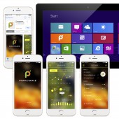
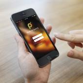
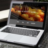
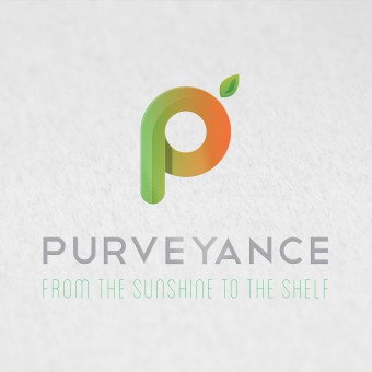
| DESIGN NAME: Purveyance PRIMARY FUNCTION: Branding INSPIRATION: The inspiration for this branding and extended project was the functionality and purpose of the company itself - to provide an innovative fruit tracking system for producers - right from the tree to the supermarket shelf - which was all about quality and freshness of the produce, and which, in turn, would enable producers to get paid fairly for their products without deductions for spoilage, which is, unfortunately, common in the industry. The logo itself needed to be all about freshness - to visibly look like a really fresh piece of fruit. UNIQUE PROPERTIES / PROJECT DESCRIPTION: This project was to create the branding for an innovative tracking and payment system for fruit suppliers. The logo is symbolic of freshness and quality and adaptable into a variety of brand uses on and offline. The logo perfectly reflects the research, colours, keywords identified and is unmistakably fruit based, modern and corporate, but friendly and approachable. The slogan reflects the fact that this brand and app will be with the produce on it’s journey from the stage of picking through to arrival in store. OPERATION / FLOW / INTERACTION: This brand transforms by utilising visual design to place the company right at the top of the industry in presentation and perception. This, allied with an innovative product and system, will give them the opportunity they require. PROJECT DURATION AND LOCATION: A very short term project, this design went from initial brief to final brand realisation and app / website visual designs complete in 8 days, beginning on 16th February 2015 and being completed on 24th February 2015 FITS BEST INTO CATEGORY: Graphics, Illustration and Visual Communication Design |
PRODUCTION / REALIZATION TECHNOLOGY: The designs were created using a combination of Adobe InDesign, Adobe llustrator, Adobe Photoshop. SPECIFICATIONS / TECHNICAL PROPERTIES: As this was a wide ranging branding and digital design project, there are no specific specifications, but a large amount of separate pieces. TAGS: fresh, fruit, purveyance, design, graphic, ireland, creative, media RESEARCH ABSTRACT: With no similar service on the market, research centered around what the fruit companies see as the positive aspects of their own images. The research led us to the conclusion that this was a huge worldwide trade, but one which was very lacking in truly quality design - even at the top end of the industry, the style was outdated. This offers an advantage, as a modern brand and overall corporate look will instantly gain credibility and a perception of scale, giving opportunity to the client. CHALLENGE: The hardest part of this design - apart from the project needing to be completed in 8 days - was the creation of the brand itself. Particularly where aspects of quality and freshness are at stake a lot of experimantation with shape, colour, gradient etc was required to ensure the icon - the hook on which everything else would hang - was just right. We experimented with a variety of logo styles, type, colour schemes to settle on the best and most appropriate branding. ADDED DATE: 2015-03-10 14:56:29 TEAM MEMBERS (1) : Nigel Morrison IMAGE CREDITS: All images Nigel Morrison |
||||
| Visit the following page to learn more: http://www.creativemediani.com | |||||
| AWARD DETAILS | |
 |
Purveyance Branding by Nigel Morrison, Creative Media is Winner in Graphics, Illustration and Visual Communication Design Category, 2014 - 2015.· Press Members: Login or Register to request an exclusive interview with Nigel Morrison, Creative Media. · Click here to register inorder to view the profile and other works by Nigel Morrison, Creative Media. |
| SOCIAL |
| + Add to Likes / Favorites | Send to My Email | Comment | Testimonials | View Press-Release | Press Kit |

