Basik Packaging by Saana Hellsten |
Home > Winners > #40637 |
 |
|
||||
| DESIGN DETAILS | |||||
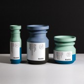
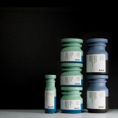
| DESIGN NAME: Basik PRIMARY FUNCTION: Packaging INSPIRATION: Basik was born as the result of my thesis based on gendered visual language. The thesis criticizes packaging that perpetuates gender stereotypes and sees gender-neutral packaging as a factor that can encourage gender equality and create a more sustainable world. The name Basik refers to neutrality. I am digging into the basics of the products and leaving out the extra, such as the unnecessary gendered visual language. The project shows how the same gender-neutral solutions, when done well, can work throughout an entire product range. UNIQUE PROPERTIES / PROJECT DESCRIPTION: Basik criticizes packaging that perpetuates gender stereotypes. By using gendered visual language as a tool for communicating an attribute of a product, the traditional stereotypes are being enforced. In Basik, the focus is on the function, which in the case of household products is being stackable. Shaving products use highly gendered visual language to communicate the gender of the intended customer. Basik gives the option to choose and customize the product based on its purpose, not gender. OPERATION / FLOW / INTERACTION: The household products are normally bottles of different sizes and shapes. They are necessary items but take a lot of space. My modular solution enables the bottles to be stacked on top of each other and thus taking less space. The razor design serves the user better because it has been customized strictly for the intended purpose (and not gender). It also enables the user to show their personal values and style without being overwhelmed by the visual stereotypes of his/her gender. PROJECT DURATION AND LOCATION: The research phase lasted from January to May and the design and production phase lasted from September to December of 2014. FITS BEST INTO CATEGORY: Packaging Design |
PRODUCTION / REALIZATION TECHNOLOGY: As the products are still on a concept-level, the production methods used were merely to she the idea of the product. The jars and the razors handles are 3D printed. The tubes and boxes were created by using existing materials and shapes. The products were then sanded and spray painted and the label was added. SPECIFICATIONS / TECHNICAL PROPERTIES: The razor box: 60mm x 25mm x 205mm The razors; 40mm x 150mm The lotions: 65 x 170mm Drain opener: 88mm x 88mm x 150mm Laundry detergent: 88mm x 88mm x 103mm Air freshener: 45mm x 45mm x 150mm TAGS: gender, neutral, razor, minimal, function, stackable RESEARCH ABSTRACT: I have always been intrigued by the use of gender stereotypes in design. I myself find it often that I prefer the men’s products to the women’s, because I don’t like pink. My thesis allowed me to look more into the world of gender stereotypes and identities, where they derive from and how much of them come from our surroundings, upraising and education. And most importantly, what happens when instead of offering only the masculine and feminine options, we give also the third, the neutral option. CHALLENGE: I wanted to show that gender-neutral objects can be colorful. The color palette of Basik was formed by conducting a survey in which the participants chose their preferred colors from sets of three, consisting of a masculine, feminine and neutral color. The label design unified throughout the products. The information is minimal, which directs the attention into the most important factors. The icons show the purpose of the product and help the consumer find the right product easily and fast. ADDED DATE: 2015-03-08 03:13:02 TEAM MEMBERS (1) : 3D model producer: Eugene Kim IMAGE CREDITS: All images: Saana Hellsten |
||||
| Visit the following page to learn more: http://saanahellsten.com/ | |||||
| AWARD DETAILS | |
 |
Basik Packaging by Saana Hellsten is Winner in Packaging Design Category, 2014 - 2015.· Read the interview with designer Saana Hellsten for design Basik here.· Press Members: Login or Register to request an exclusive interview with Saana Hellsten. · Click here to register inorder to view the profile and other works by Saana Hellsten. |
| SOCIAL |
| + Add to Likes / Favorites | Send to My Email | Comment | Testimonials | View Press-Release | Press Kit |
Did you like Saana Hellsten's Packaging Design?
You will most likely enjoy other award winning packaging design as well.
Click here to view more Award Winning Packaging Design.


