DESIGN NAME:
Rook
PRIMARY FUNCTION:
Cafe Bar Delicatessen
INSPIRATION:
Rook means tower, meaning metaphorically a strategy game on a contemporary entertainment chessboard. A design concept based on the contrasting nature of White and Black aiming at cutomers that color their routine with strong moments of joy.
UNIQUE PROPERTIES / PROJECT DESCRIPTION:
It is a new brand that will operate delicatessen bars in buildings of historic importance offering an alternative choice for visitors to enjoy a conceptual reuse of an old building to a contemporary setting. The brand places great importance on the service and the product selections chosen from organic farms in the vicinity in order to introduce healthy eating habits especially in tourist areas. Traditional cuisine plays an important and determining role not only in terms of taste but also because tradition is a link between past and future.
OPERATION / FLOW / INTERACTION:
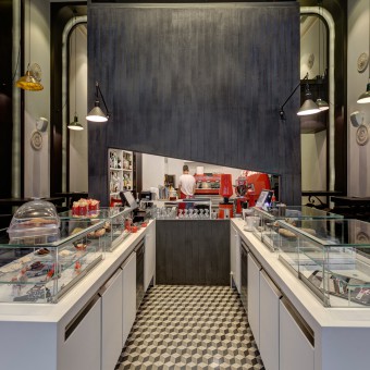
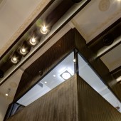
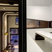
The space is extended in three levels, the basement, the ground and the mezzanine floor accommodating the meeting room. The basement part of the foundations of an old building built over ancient ruins is used as wine tasting bar. The water element is brought in the design schemes with two opaque glass lanes flanked on both sides of the black cubical structure on the ground level. The glass allows daylight to flood the basement, while they act like a metaphor of a crack in time, the moment that ancient foundations are discovered through a crack on the ground connecting past and present. The height of the ground space enabled the functional zones of service, preparation and bathrooms to be accommodated in a black box that extends from floor to ceiling. Reminiscent of Roman architecture is the design of the metal arches that cross the space from floor to ceiling on the traverse axis of the floorplan. The same arches of black burnt metal are repeated on the bar façade bringing memories of the grandeur of ancient city. Each arch is extended providing the bar counter with swivel stools for the customers to enjoy the products served. The Cubical structure is like a black coal of mineral powder acting like a metaphor of minerals while its interior is creamy white to add contemporary minimalism in the kitchen area, the meeting room and bathroom areas.
PROJECT DURATION AND LOCATION:
December 2013 to May 2014, for Design and Construction
|
PRODUCTION / REALIZATION TECHNOLOGY:
In the basement antique metallic finishes, vintage leather come to add the essence of old, which is enhanced by the reserve wines, cognac and home made liquor, while the exposed structural beams emphasize the reuse. The red brown palette is enhanced by warm lighting bulbs of the Scandinavian version of work lamps in 24K gold, bringing memories of mines, while gold brings the element of luxury and valuable. All the black burnt metals were cut using advanced CNC technology while, advanced techniques were employed to give vintage finishes to all the materials used in the project. Walls and the white plastered ceiling are decorated with patina motifs that add a retro feeling to the contemporary space in order to emit the familiar and homely, while the same feeling is enhanced by the black and white antique cement tiles found in Roman villas. The same tiles like a ribbon of old memories continue into the hygiene areas with custom made cement basins and the white lava plaster. The zones of materials along the longitudinal axis continue on the right and left side of the ground with anthracite grey leather finish custom made plaster finish emphasizing the importance of materials in the zonal design of the space, cross or longitudinal. Contemporary materials like CORIAN for the product displays and glass are used in combination with metal and marble that are treated with special technology in order to emit the patina of time. Only Led lighting is used for the Main hall and the functional areas, while vintage bulbs for the foundations basement.
SPECIFICATIONS / TECHNICAL PROPERTIES:
140 square meters ground and basement
TAGS:
Bar, cafe, delicatessen, adaptive reuse, ancient city, roman architecture, flagships store, adaptive minimalism
RESEARCH ABSTRACT:
The fact that the building is located over ancient city ruins determined the research of the context, typologies of Roman architecture and roman baths since they dominate the existing city and attract tourism every year from all over the world. In the vicinity there also METEORA the huge black stones, which informed the concept of the black cubical structure extending from floor to ceiling and treated with mineral powders. Moreover, research was conducted in healthy and organic eating, adaptive reuse case studies from around the world, as well as relevant literature for the branded environment of entertainment.
CHALLENGE:
A a historic building built over the ruins of Ancient Trikki. It was a very important city of Thessaly Valley built around Lithaios river. The old walls found in the building basement were kept intact and reinforced with goat’s wool and white clay an old mason’s technique in wall building. The ground level is supported by metal structural beams designed in order not to destroy the buildings walls and foundations and draw a clear line between old and new. It was a challenge to adapt roman architecture typologies, overcome state regulations regarding building adaptation to bars and restaurants without destroying the elements of past. The project is a flagship store so it needed a design that would keep the elements of historical importance but also be adaptable to buildings or cities with different history.
ADDED DATE:
2015-02-27 18:14:46
TEAM MEMBERS (4) :
Helen Brasinika, Principal Designer, Researcher & Co-founder, Brasinika Panagiota, Design Assistant Project Management , Anastasia Rokkou, 3D Cad & Renderings and Chris Kougoulos, Civil Engineer Construction
IMAGE CREDITS:
George Fakaros
|


